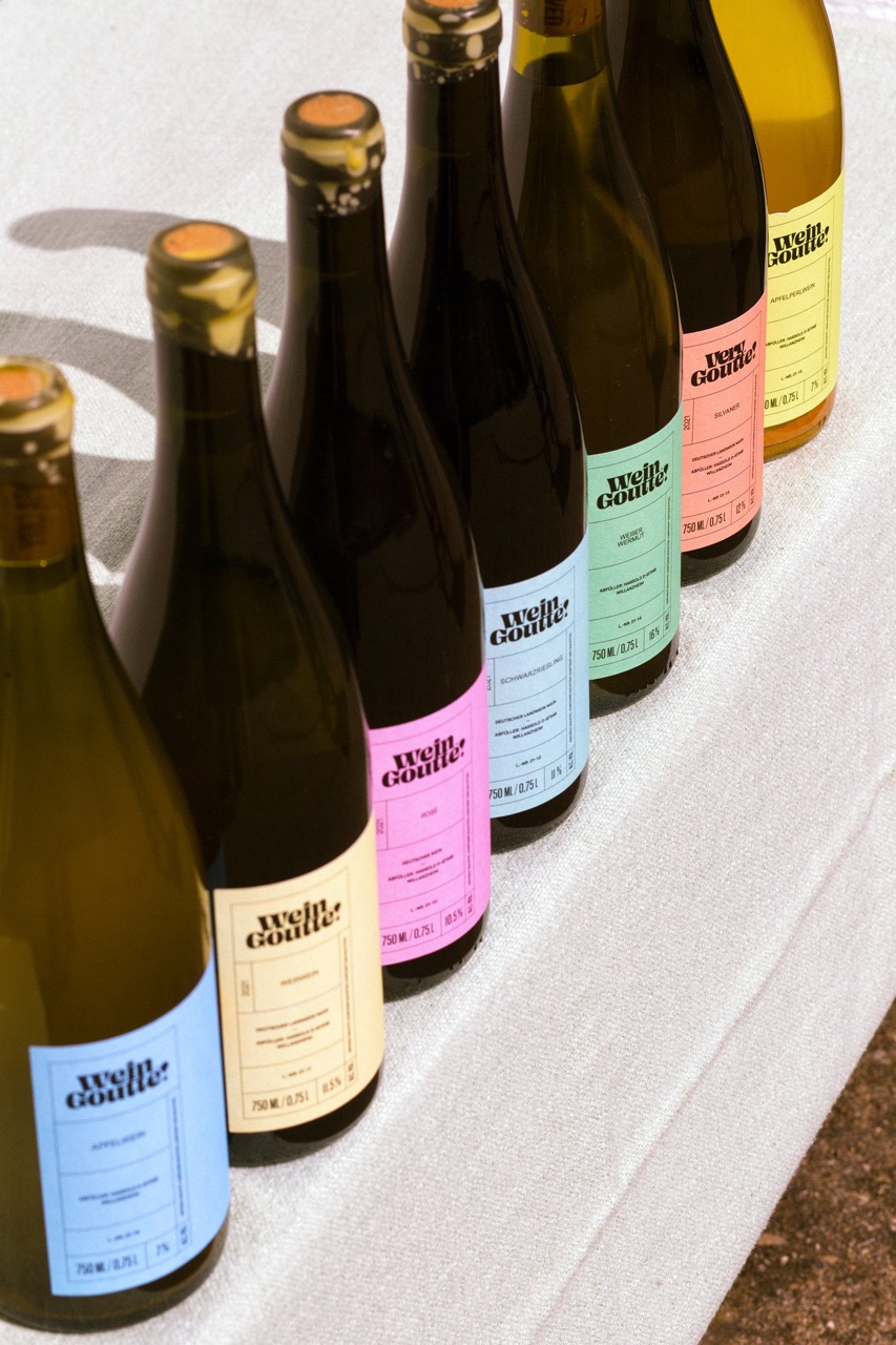
Simon Roy’s update for Wein Goutte leans into a stripped-back system.
The labels are oversized color blocks, and the tiny oval stickers are barely there. The tight typography, small icons, and short phrases create a contrast between the large fields of color. Across the range, the consistency of layout paired with shifting palettes keeps the collection orderly without flattening its character. This is minimalism.