TAM’s Ginger Beer Celebrates the Many Shapes of Its Main Ingredient

TAM’s Ginger Beer Celebrates the Many Shapes of Its Main Ingredient


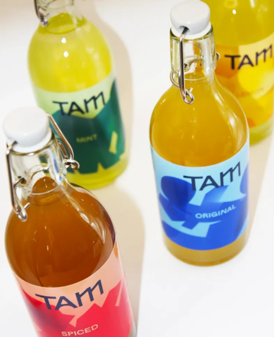
TAM’s ginger beers are all in favor of graphic modernism. Leyma Design paired a utilitarian swing-top bottle with saturated, flat color fields, while the typography is informal but sharp, with a hand-drawn looseness that signals approachability. Abstract shapes hint at flavor profiles instead of literal ingredients. TAM is clean, contemporary, and confidently uncomplicated.


Source link

Get Packaging Industry News updates

Get the most critical Packaging Industry news in your email each week.


We promise no spam email will send you.

Leave a Reply

Your email address will not be published. Required fields are marked *

Related Articles
UK to consult on recycled plastic under packaging tax
Barbara RuckerMay 19, 2026

The government will review submissions and issue a formal response at a later stage.…

Mondi redesigns packaging for Ovoko car parts shipments
Barbara RuckerMay 19, 2026

Mondi adapted an existing heavy-duty packaging design for e-commerce use. Credit: Mondi / Ovoko.…

International Paper acquires Delmarva Corrugated Packaging
Barbara RuckerMay 19, 2026

In the first quarter of 2026, International Paper posted net sales of $5.97bn, an…

Bob's Red Mill Unveils New Logo and Product Packaging
Barbara RuckerMay 18, 2026

Bob’s Red Mill, a leader in the homemade food movement for nearly 50 years,…