SP51 Gets the Green Light at the Bar

SP51 Gets the Green Light at the Bar


Even adults love interactive design.

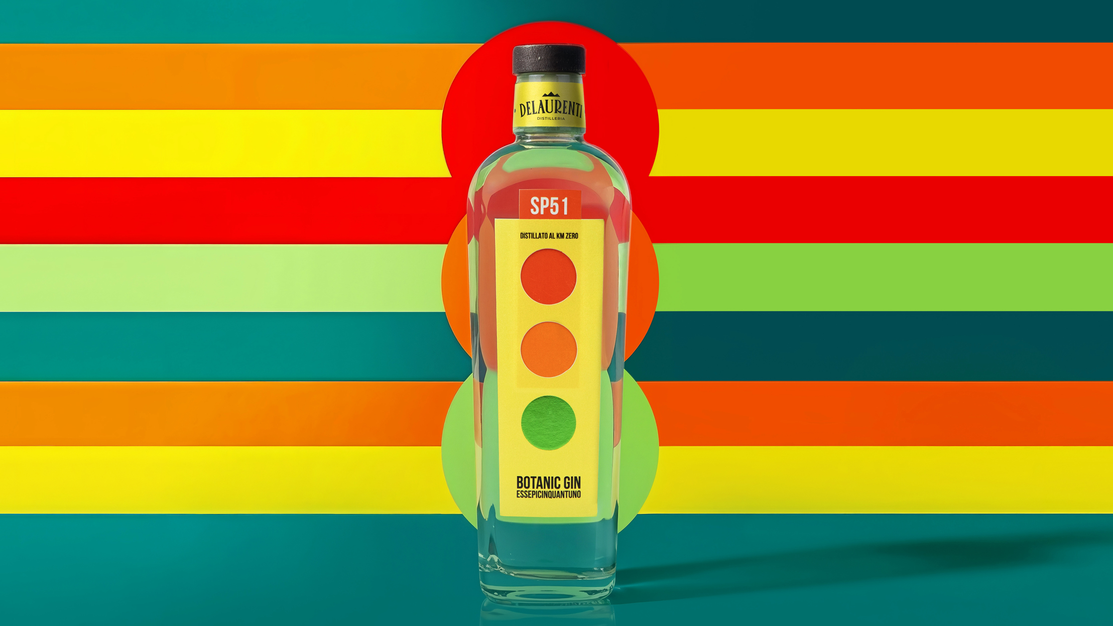
SP51’s packaging by Killeridea borrows from traffic signage and industrial logic rather than spirits tradition. The vertical label reads like a signal panel, with stacked circles referencing traffic lights. The typography is compressed, prioritizing clarity over flourish. Yellow, red, and green push urgency and precision, nodding to urban systems and Italian graphic modernism. The pull tab transforms the bottle into an interactive object, rare in the spirits market. 


Source link

Get Packaging Industry News updates

Get the most critical Packaging Industry news in your email each week.


We promise no spam email will send you.

Leave a Reply

Your email address will not be published. Required fields are marked *

Related Articles
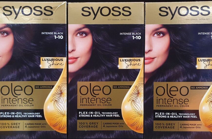
Syoss pack updated through industry partnership
Barbara RuckerMay 29, 2026

MM Packaging oversaw the production stage of the project, which was completed over eight…

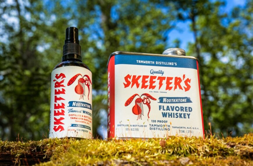
Buzzkill No More: Skeeter’s Nootkatone Flavored Whiskey Protects Your Summer Cocktails
Barbara RuckerMay 29, 2026

Tamworth Distillery has released Skeeter’s Nootkatone Flavored Whiskey, an insect repellent for cocktails Designed…

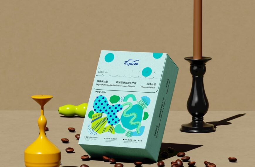
Myaizg Borrows Ciggy Pack-Cool and Injects Its Coffee With Whimsy
Barbara RuckerMay 29, 2026

Coffee packaging has always been an interesting topic to discuss, and it’s often caught…

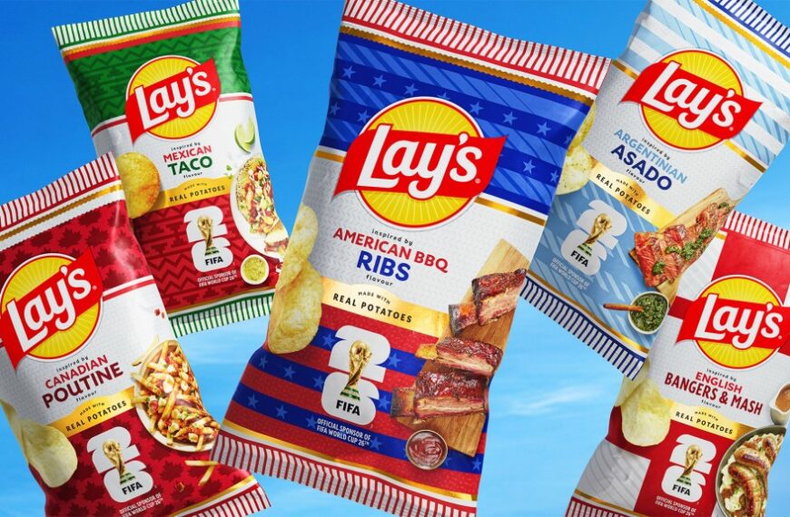
Lay’s Turned Soccer Scarves Into Country-Coded Chip Bags For The World Cup
Barbara RuckerMay 29, 2026

Lay’s has a long history of leaning into limited edition collaborations to drive cultural…