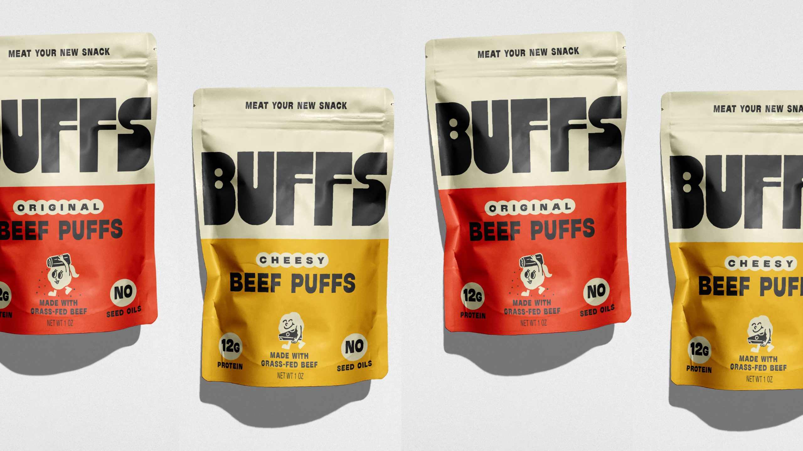
- Herefor Studio creates a modern identity for Buffs using clean color blocking and oversized typography.
- The design moves away from traditional jerky cues, offering a more approachable and craveable snack brand.
I wish more snack brands would try to say less, at least visually speaking.
Color blocking leads the experience here, with creamy neutrals paired against yellows and reds that separate flavors while keeping the system cohesive. The layout is clean and scannable, leaning into how people actually shop. The small graphic icons, like the cheerful character and simple badges, bring in just enough personality without overwhelming the design.