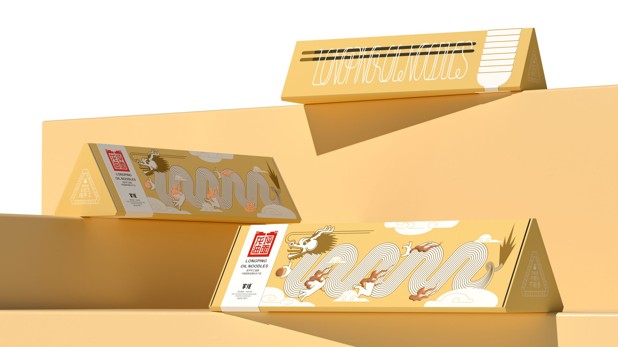
This packaging feels right at home in today’s wave of editorial-inspired design, where food products borrow the language of art books and zines rather than supermarket conventions.
Designed by Wow Creative Design (Shenzhen) Co., LTD for Longping Oil Noodles, the structure sets the tone with a sculptural triangular form that unfolds. The golden yellow palette leans into associations of wheat, warmth, and prosperity, and across the surface, a flowing dragon illustration morphs seamlessly into looping noodle strands. The typography contrasts this movement with a crisp label block that feels editorial and restrained, grounding the expressive illustration with balance.
What really sets it apart from others in the category is how it treats packaging as a narrative object, merging cultural storytelling, structural design, and graphic experimentation into something that feels genuinely new. It perfectly balances expressiveness with elegance, rare in the noodle aisle.