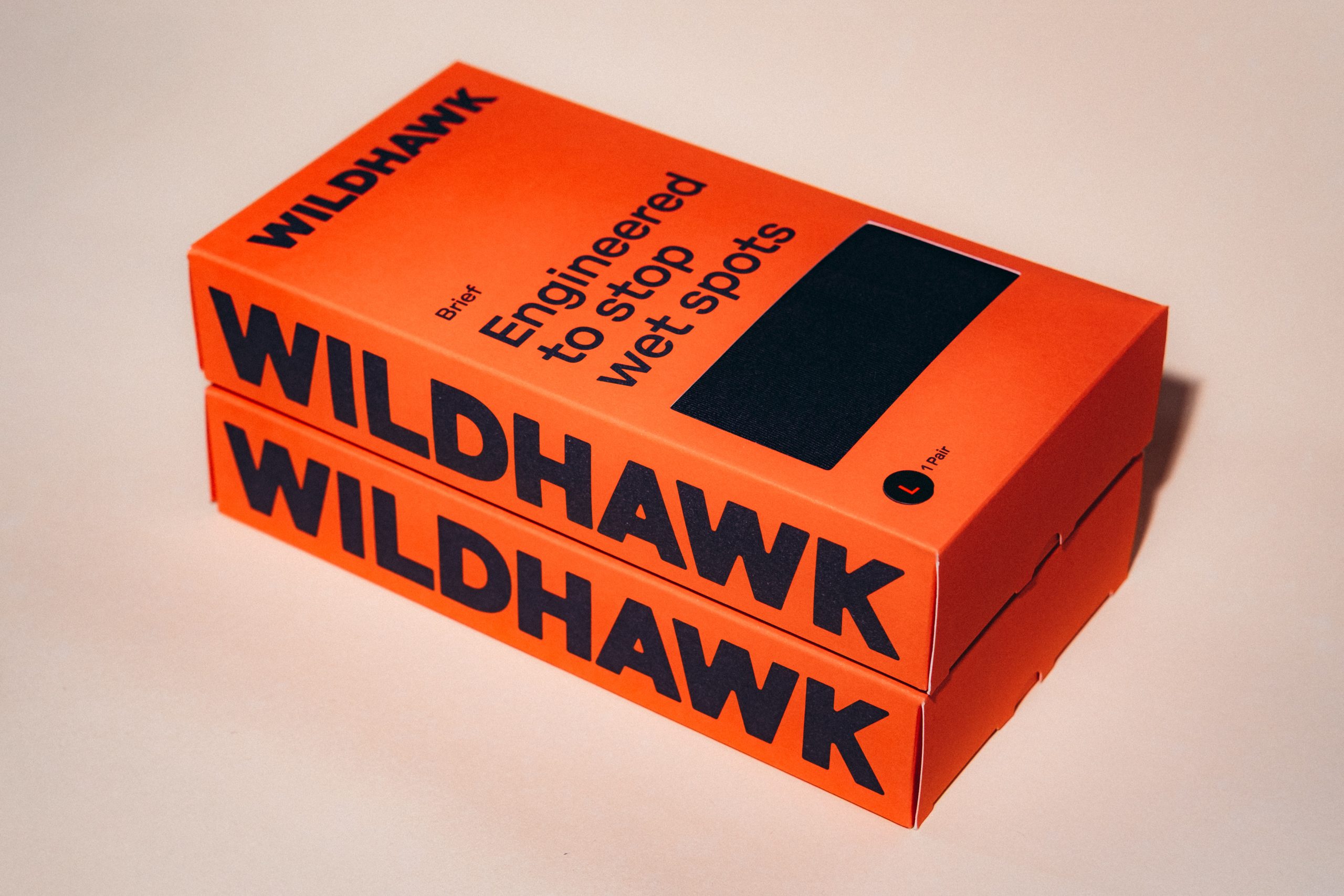
Packaging that leans solely on bold, sans serif type and a duo of strong colors will always stand out.
For Wildhawk, Red Antler‘s approach leans heavily into typography as the main visual language, with oversized, unapologetic letterforms wrapping the box and turning the brand name into a full-fledged, confident identity. Additionally, the electric orange color instantly shifts the conversation.
Supporting graphics and diagrams introduce the product’s technical innovation in an informative way. What makes this stand out is how it reframes a sensitive topic through confidence and design clarity, creating a product that feels like a smart upgrade rather than a quiet fix, and inviting a new audience into the category with ease.