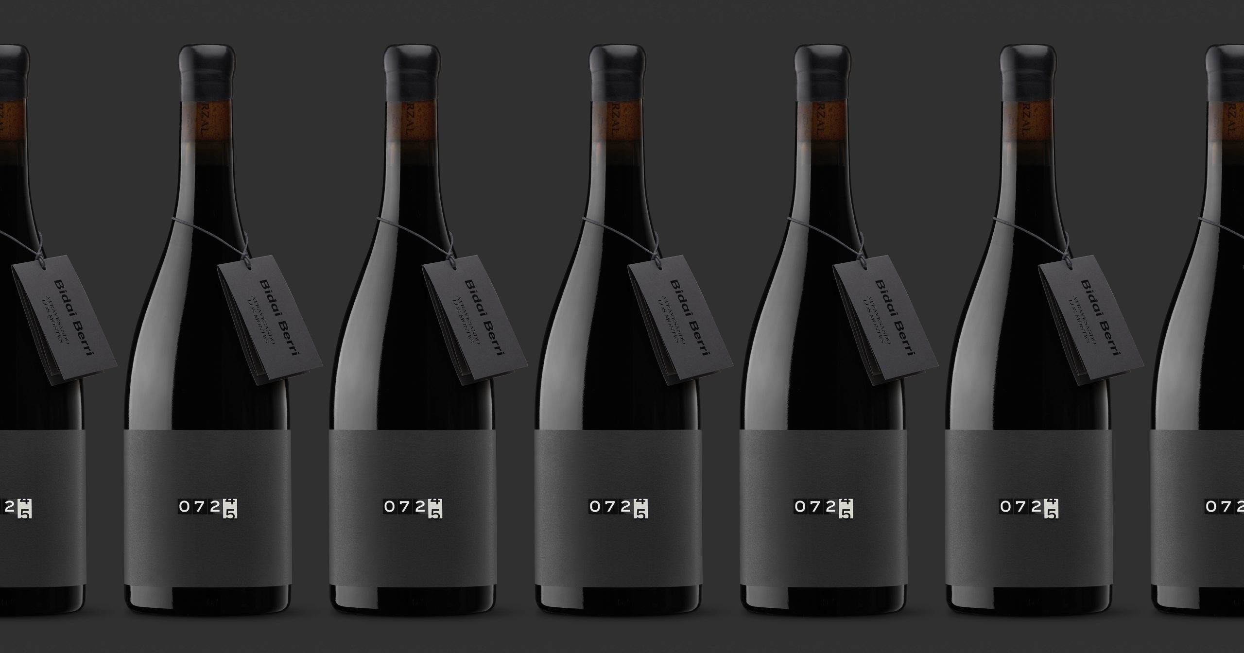
- Bidai Berri by Moruba uses a minimalist odometer inspired label to express the concept of a journey through typography and restrained design.
- The deep monochrome palette and conceptual clarity set it apart as a modern and memorable wine identity.
Wine labels often lean into ornate storytelling or illustrative tradition, but this design takes a sharply pared-back approach. For Bidai Berri, Moruba distills the idea of a journey into a single gesture, using an odometer-inspired number system as the central visual cue. It’s poetic and cryptic, but also restrained. The deep charcoal and black palette reinforces this sense of quiet intensity, and even the secondary tag, understated and neatly tied, adds to the sense of intention.