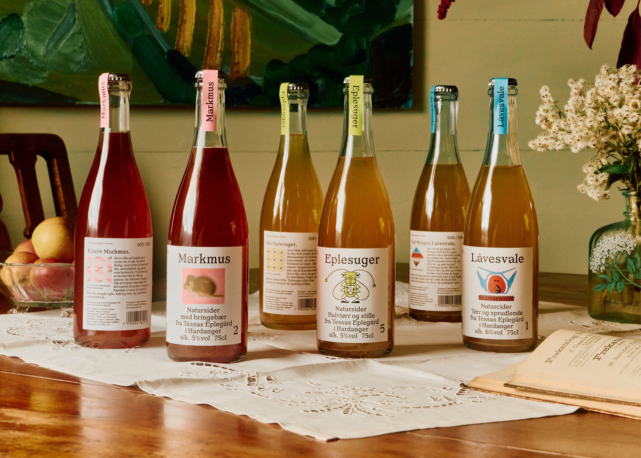
While the rest of the cider world is leaning into rustic scripts and moody earth tones, this packaging features a hand-drawn bug illustration and a personal letter addressed directly to the drinker.
Oslo-based design studio OlssønBarbieri created the identity for Tessas Eplegård, a small-batch Norwegian cider producer from Hardanger, and the result feels like something you’d find tucked inside a friend’s art portfolio. Each bottle features a whimsical creature illustration inspired by Scandinavian folk art traditions. The typography is a delicious mix of serif for the product names and a looser, almost editorial sans-serif body text.
What really sets it apart is the decision to write the back label as a direct address, “Hei Eplesuger,” which translates to “Hey Apple Sucker,” turning the usually ignored back panel into a tiny piece that makes you feel like you and the brand share inside jokes.