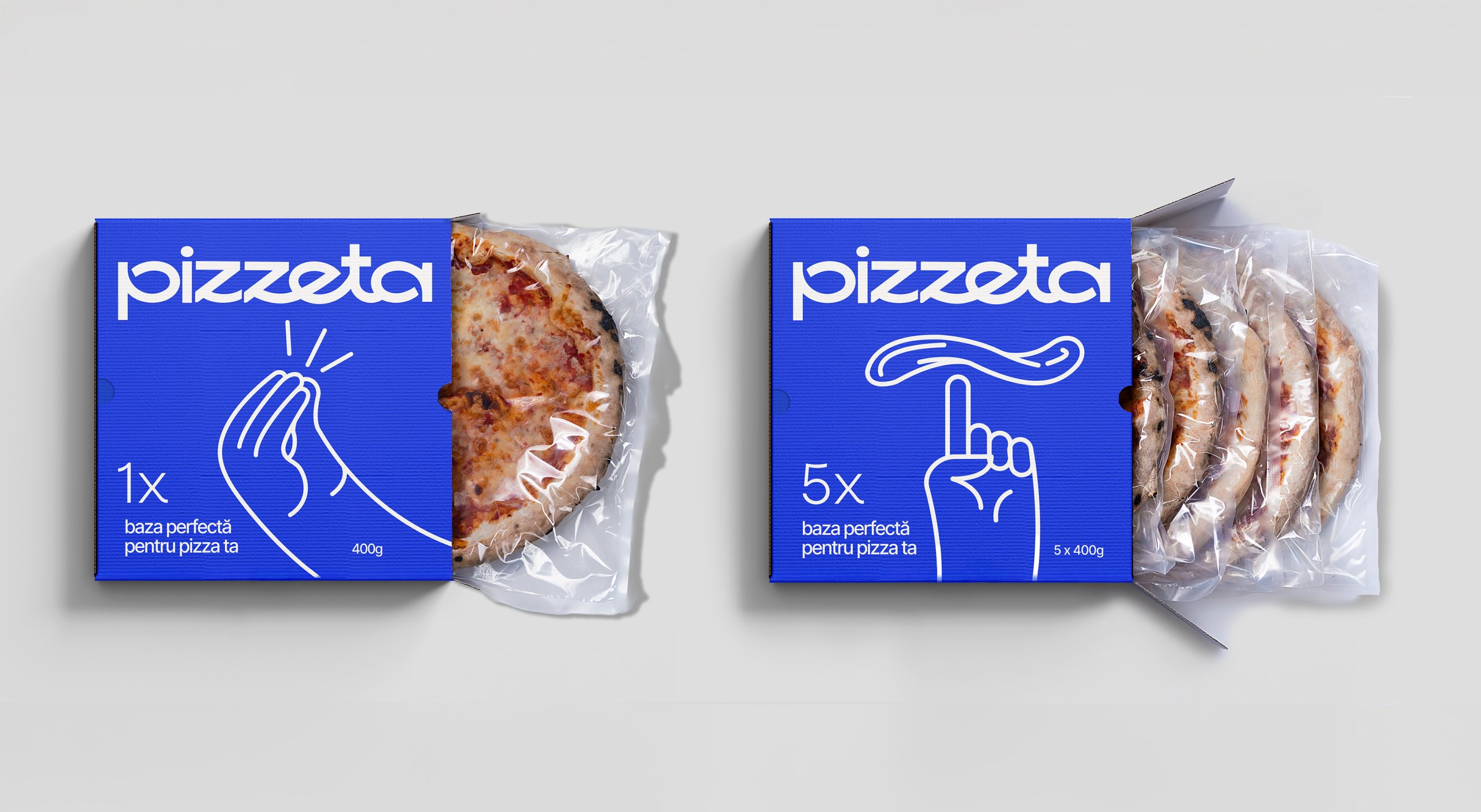
The meal kit and ready-to-eat category is already very crowded, so when BroHouse took on the challenge of making Pizzeta stand out within it, they stripped away every tired food packaging cliché and replaced it all with the expressive, joyful, and instantly human language of Italian hand gestures.
Pizzeta, designed by BroHouse for this artisanal pizza base brand, roots its packaging in one of Italy’s most universally recognized cultural signatures, using expressive line-drawn hand gestures as the hero illustration. The gestures draw from a centuries-old tradition of nonverbal communication that carries warmth, humor, and immediacy across language barriers. The Pizzeta wordmark sits in a rounded, slightly quirky sans serif with a warm Mediterranean looseness, comfortably set against the cobalt blue. The checkerboard pattern that runs along the base of the box is a fun finishing detail that never feels overly cliché, keeping the whole system grounded in culture while staying completely fresh.