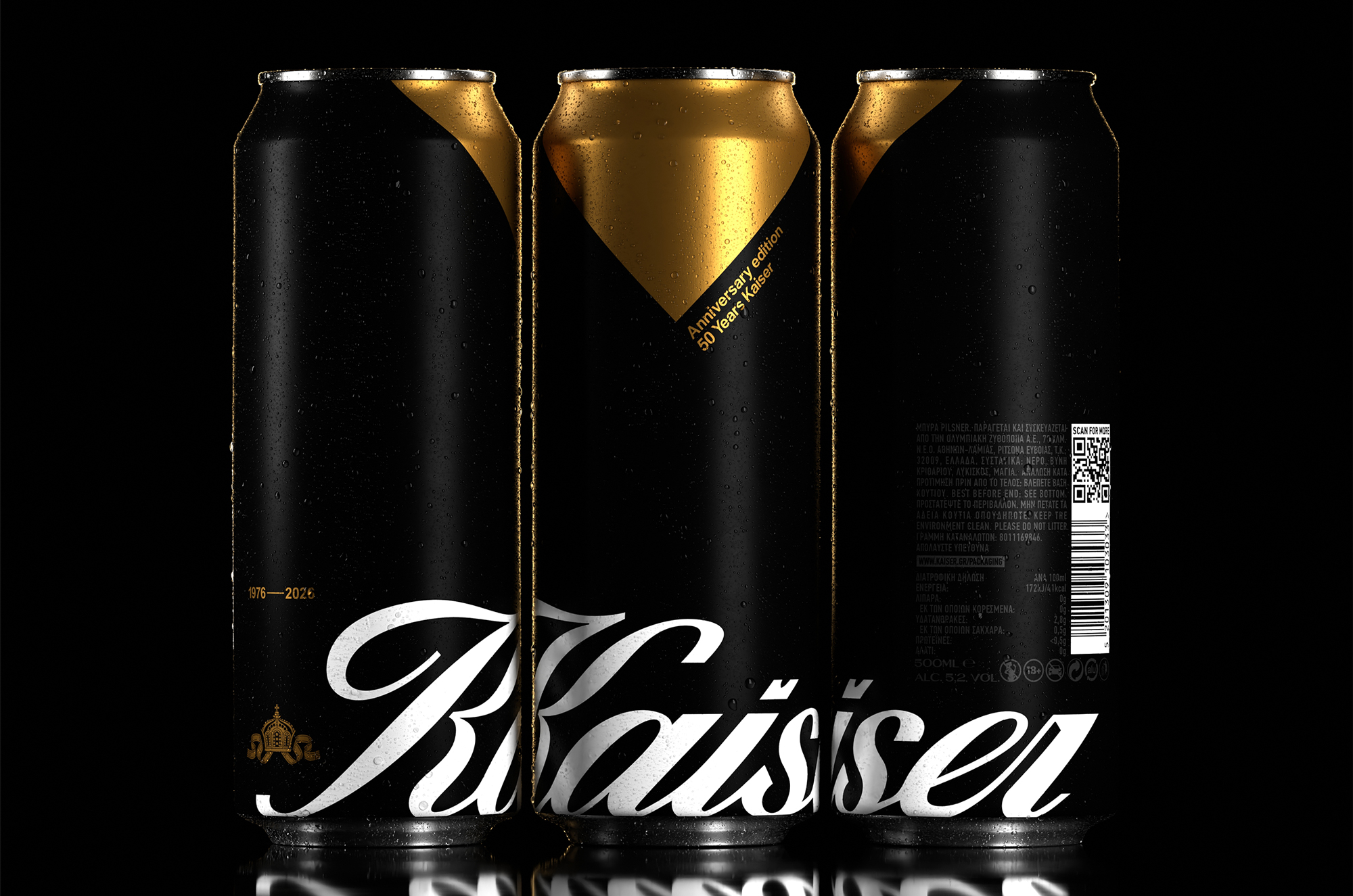
Kaiser’s 50th anniversary edition, designed by Luminous Design Group, takes a single detail that has lived quietly on the bottle neck since 1976 and expands it across the entire design system. That detail is the gold foil neck wrap, a Kaiser signature so familiar to Greek beer drinkers that it has become shorthand for the brand itself.
The Kaiser wordmark runs large across the lower black band in a sweeping high-contrast italic script that feels cinematic and fashion-forward, the kind of typographic choice you would expect to see on a limited edition champagne or a premium tequila. The recognition that the most powerful anniversary design does not add things but instead distills a brand down to its single most meaningful visual truth and then turns that truth all the way up is a smart move.