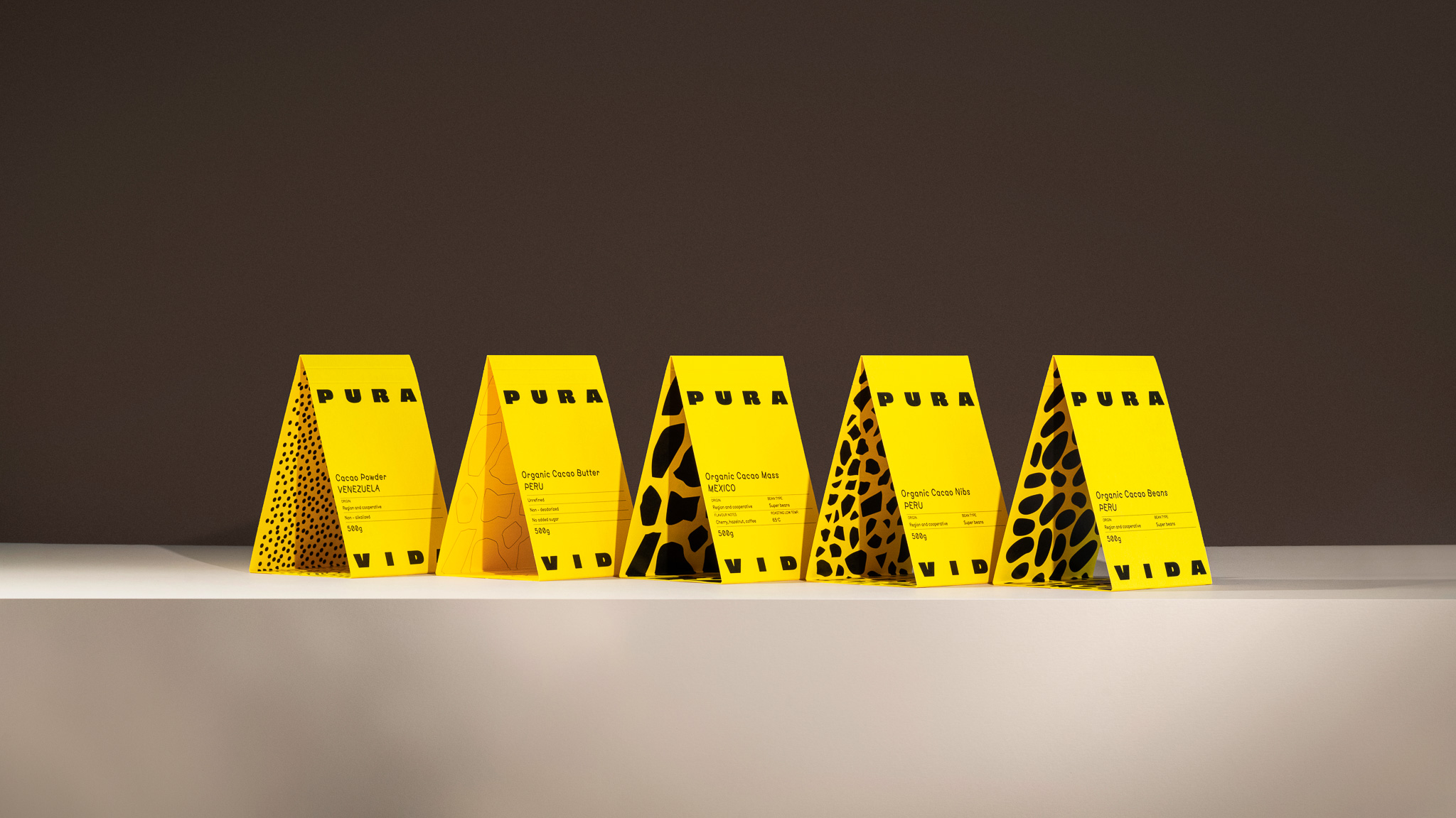
Pura Vida Cacao’s packaging, designed by Two Creatives, walks straight past all of the cliché cacao visual cues with a saturated yellow pack. Each product’s reverse side reveals a black pattern, including dots for cacao powder, organic blob shapes for cacao mass, and irregular stone-like forms for the nibs, creating a small discovery moment when you turn the package over that adds character without overwhelming the design.
Pura Vida makes a strong argument that quality can look completely accessible and that a single strong color and a clean type system are an effective strategy.