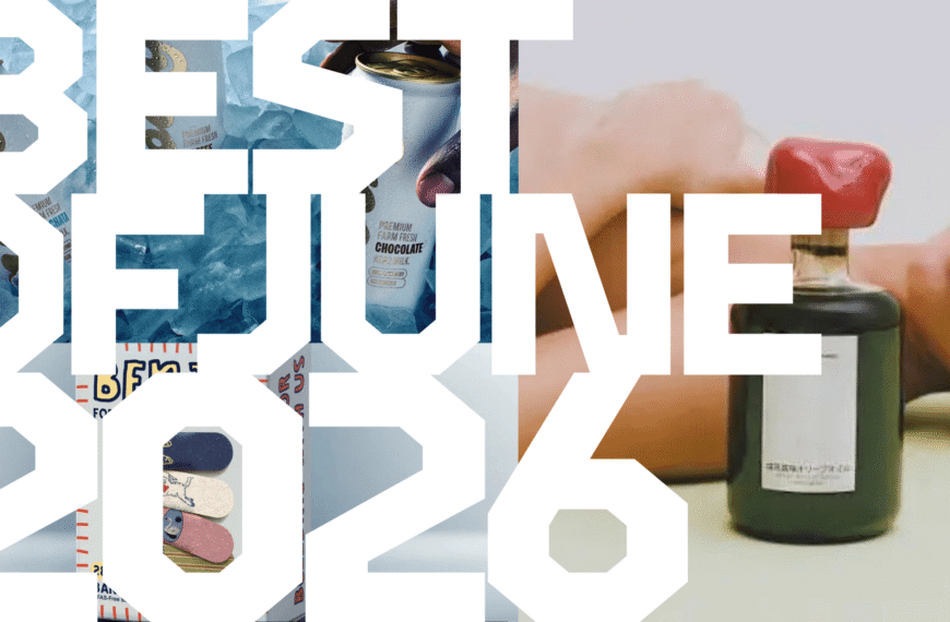
Supposedly, we are awash in a sea of maximalist and chaotic CPG packaging, with blobs of letters, high-vis Lisa Frank-style fetishization, and rave-adjacent , a direct reaction to the soft and casual blanding that proliferated a decade ago. Of course, when The New York Times is telling you this, well, that stylistic trend has likely already waved goodbye.
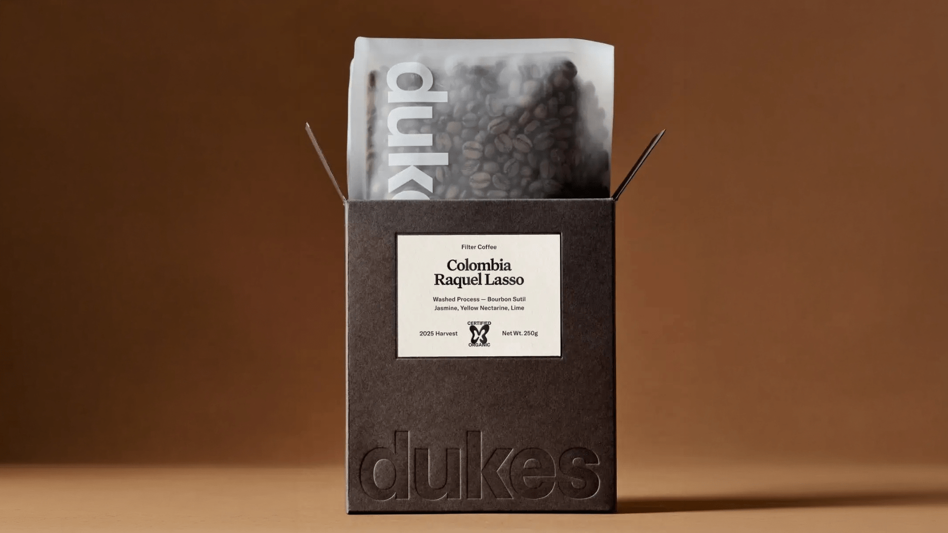
Regardless, when everything oozes Nickelodeon-slime green or every start-up announces itself with an anthropomorphic mascot, it’s genuinely refreshing to find a brand that projects elegance and restraint. Look no further than our June 2026 Pack of the Month, Dukes Coffee, courtesy of Australia’s Studio of Design and Art (SODAA). With a blind debossed wordmark and an overall sense of refinement, SODAA’s redesign for the coffee brand elevated the brand’s previous typography and brought it to the forefront.
We spoke with SODAA director Thomas Benson about how the studio approached the brief and developed a visual language for the brand as they continue to grow and evolve.