• Home
  • Packaging News
  • Before & After: Supercult Elevates Wight Tea with Bold Colors and Premium Packaging

Before & After: Supercult Elevates Wight Tea with Bold Colors and Premium Packaging

Before & After: Supercult Elevates Wight Tea with Bold Colors and Premium Packaging


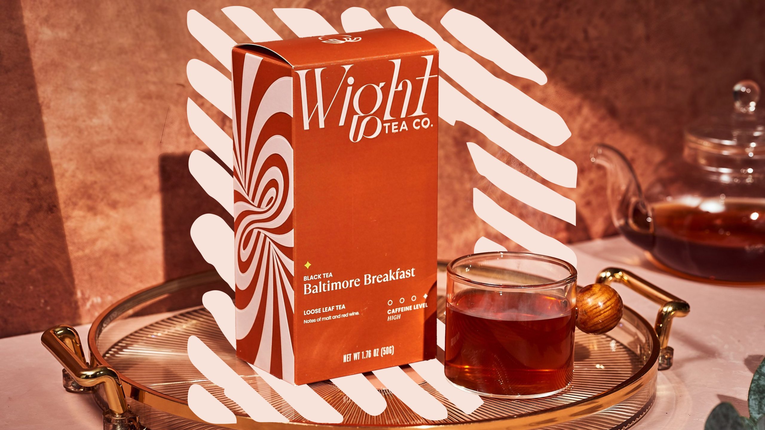
Supercult has super-transformed Wight Tea’s packaging, emphasizing a bold, flavor-forward experience with vibrant colors and a high-contrast logo. The new identity positions the upstart tea company as a premium, experience-driven brand.

Take a look at the incredible brand transformation below.


Source link

Get Packaging Industry News updates

Get the most critical Packaging Industry news in your email each week.


We promise no spam email will send you.

Leave a Reply

Your email address will not be published. Required fields are marked *

Related Articles
Sappi to Showcase Sustainable Tea Packaging at interpack
Barbara RuckerApr 15, 2026

At this year’s interpack, Sappi will be highlighting its latest innovations in sustainable tea…

Amcor Invests in New Printing Line at Hardenberg Facility
Barbara RuckerApr 15, 2026

Amcor, a global leader in developing and producing responsible packaging solutions, has made a…

Tessas Eplegård Cider Explores Honest, Farm-Friendly Storytelling
Barbara RuckerApr 15, 2026

While the rest of the cider world is leaning into rustic scripts and moody…

Pasta Fortuna Tells the Story of a Mother’s Love and a Land of Tradition
Barbara RuckerApr 15, 2026

There’s no denying that the CPG design world is deep in its maximalist renaissance,…