Showcasing The Magic of Varying Paper Opacity On Label Design

Showcasing The Magic of Varying Paper Opacity On Label Design


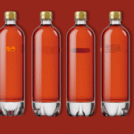
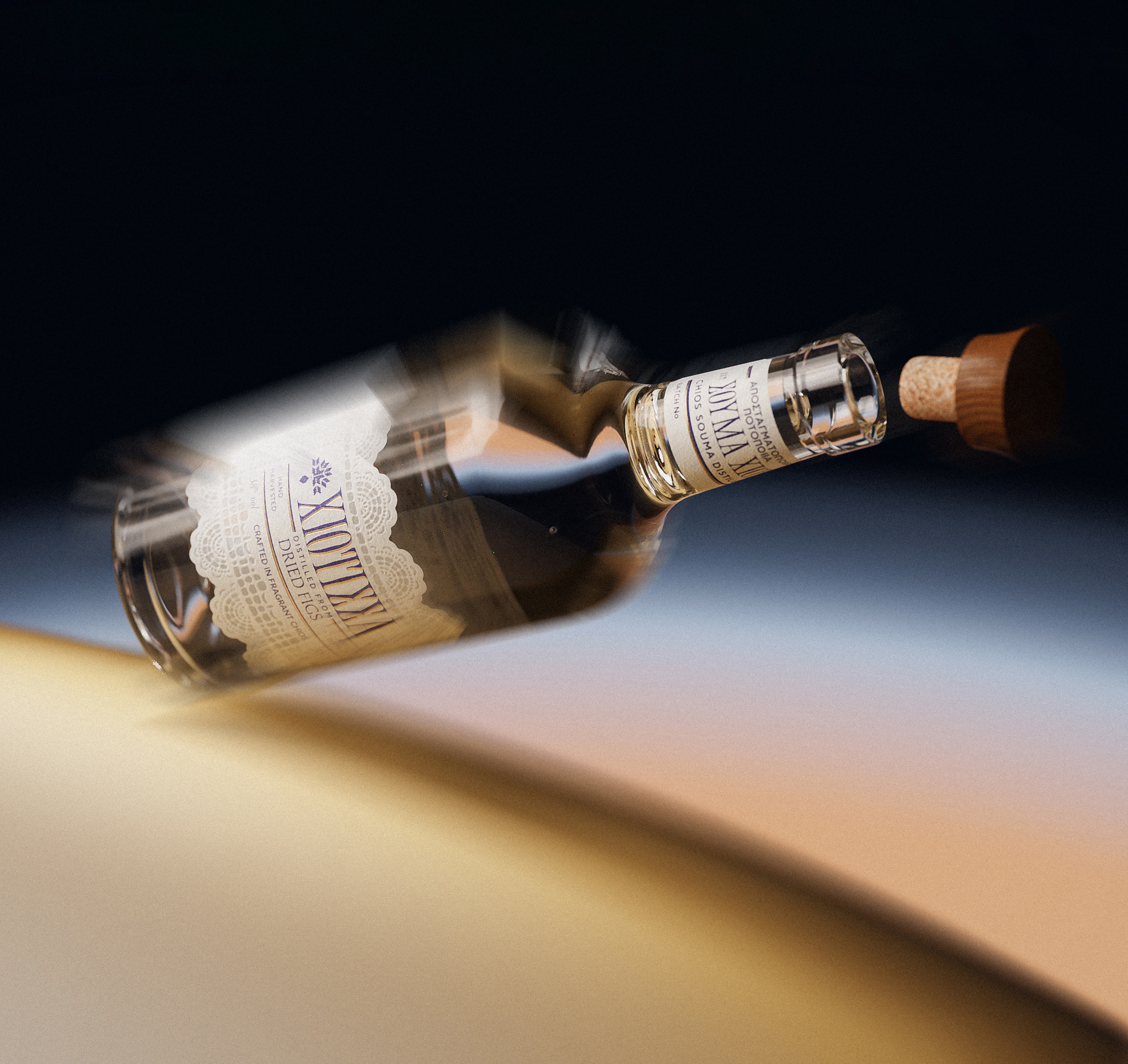
The packaging design for Hiotissa, designed by ruto design studio, draws heavily from local Chios traditions, featuring an elegant logotype with characteristic long “tails” on the vertical strokes inspired by a local artist’s signature, creating a sophisticated historical reference without feeling overly heavy.

The label incorporates traditional lace and embroidery motifs, with a unique paper that changes opacity at certain temperatures, allowing light to pass through and imitate lace holes, further enhanced by embossing, foil printing, and a custom wooden cap designed to resemble traditional hats.


Source link

Get Packaging Industry News updates

Get the most critical Packaging Industry news in your email each week.


We promise no spam email will send you.

Leave a Reply

Your email address will not be published. Required fields are marked *

Related Articles
Buckeye Corrugated, Inc. (BCI) Expands Reno Capabilities with Advanced Equipment
Barbara RuckerApr 16, 2026

Buckeye Corrugated, Inc. (BCI) today announced the installation of critical production equipment at its…

Cattyfeast Turns Cat Food Into Design Purrfection
Barbara RuckerApr 15, 2026

REWOT s.r.l. gave FIDOVET’s Cattyfeast gold foil cans and a saturated flavor-coded palette that…

The Return of the Stubby? Garage Beer Bets on Stout Bottles and 24-Can Buckets
Barbara RuckerApr 15, 2026

Garage Beer resurrects the stubby bottle and drops a 24-pack hardware bucket to stand…

Geopolitical risk reshapes packaging investment case
Barbara RuckerApr 15, 2026

Investors are shifting their focus beyond traditional growth metrics to examine how well companies…