Doop’s Branding Spotlights Our Pets’ Non-Stop Lovable Energy

Doop’s Branding Spotlights Our Pets’ Non-Stop Lovable Energy


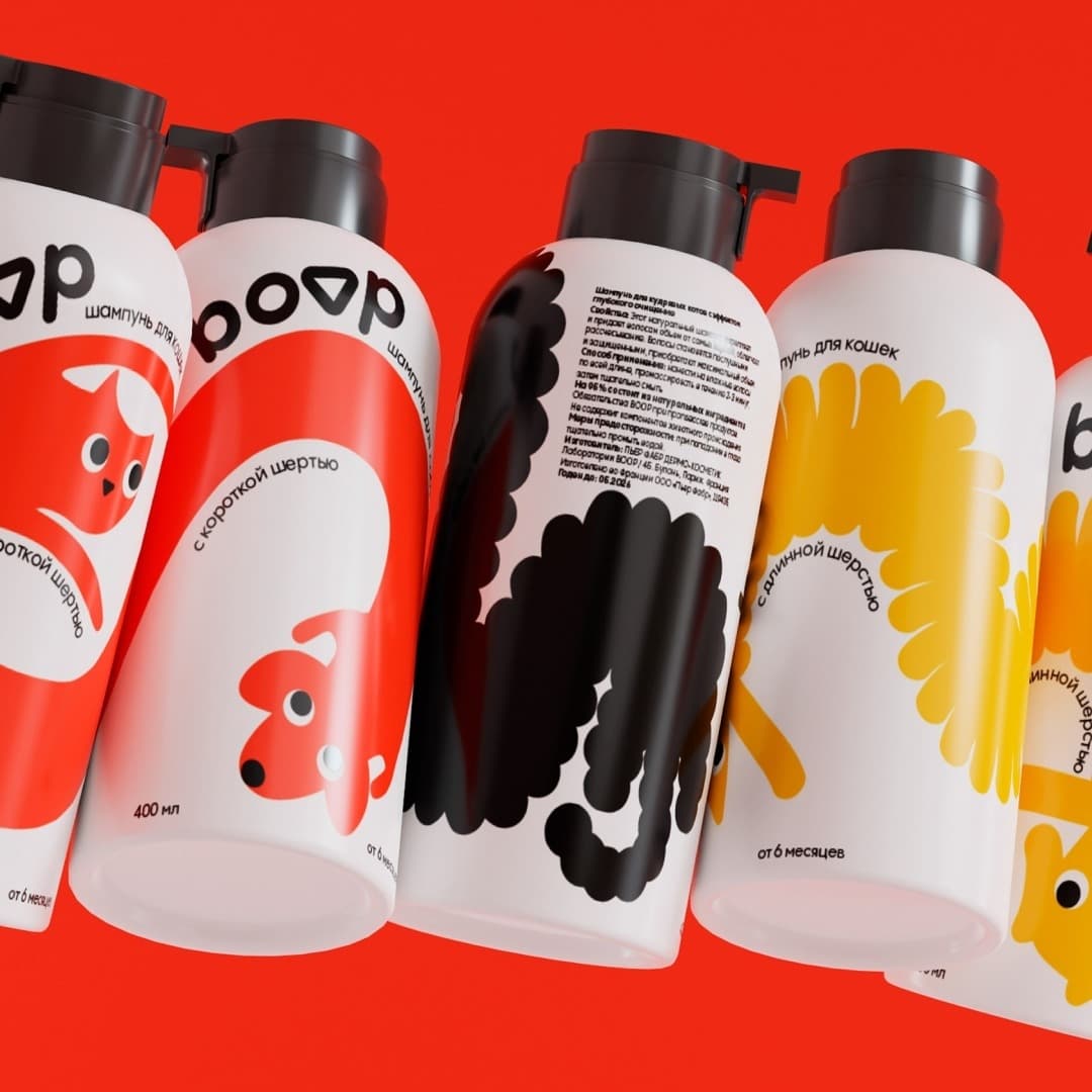
The Doop pet care packaging features playful typography emphasizing the brand’s modern and approachable identity, with bold, rounded fonts positioned dynamically across the top of the bottle. The bright color palette adds energy and ensures shelf visibility while differentiating products based on pet types or coat needs.

The whimsical illustrations of animals integrate with the text, wrapping around the bottle to create a visually engaging design. The minimal yet bold approach maintains clarity and functionality, but the playfulness intertwined with the illustrations highlights what all pet owners deal with daily: a lovable sense of energy.


Source link

Get Packaging Industry News updates

Get the most critical Packaging Industry news in your email each week.


We promise no spam email will send you.

Leave a Reply

Your email address will not be published. Required fields are marked *

Related Articles
Takashi Murakami Brings His Signature Flower Power To Dom Pérignon
Good Grains Makes Cereal Worth Trusting
Barbara RuckerMay 19, 2026

Good Grains by Gel proves that organic cereal can be just as visually exciting…

Last resort Alert: Cut Dr. Wunderer’s Wine Label Into Pieces 
Barbara RuckerMay 19, 2026

Wunderer by Alessandri Design hand-cuts every label with a scalpel and reassembles it in…

72andSunny Bakes A New Brand Identity For Panera Bread
Barbara RuckerMay 19, 2026

Panera’s new visual brand identity comes courtesy of the Los Angeles-based agency 72andSunny. The…

UK to consult on recycled plastic under packaging tax
Barbara RuckerMay 19, 2026

The government will review submissions and issue a formal response at a later stage.…