Noon Goes From Chrome To Clear

Noon Goes From Chrome To Clear


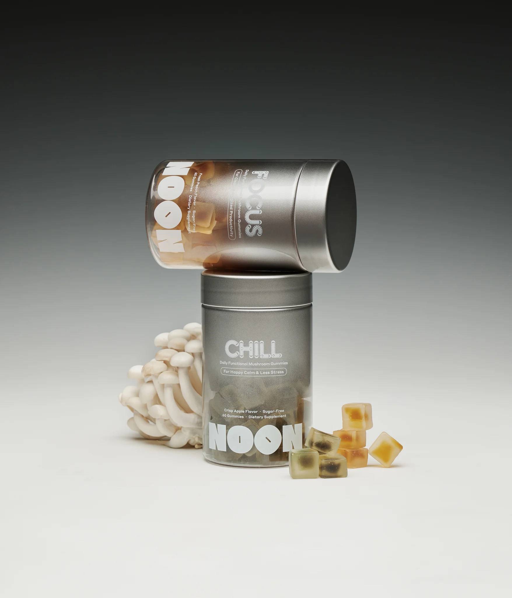
The packaging for NOON, designed by Jane Kate Wong and Eric Hu, combines a scientific aesthetic with a natural take. The stainless steel finish mirrors laboratory precision, while the gradient-bleed into transparency showcases the colorful gummies inside, symbolizing a sense of symmetry between neuroscience and nature.

The typography is bold yet clean, ensuring legibility while complementing the minimal yet functional design. And while there’s a deep scientific take, a sense of approachability helps keep these vitamins from feeling overly medicinal.

Jane Kate Wong offers a glimpse behind the design below.


Source link

Get Packaging Industry News updates

Get the most critical Packaging Industry news in your email each week.


We promise no spam email will send you.

Leave a Reply

Your email address will not be published. Required fields are marked *

Related Articles
So, How Do You Really Feel About AI? Tell Us In Our New Reader Survey
Barbara RuckerMay 20, 2026

Chances are, if you’re a working designer or agency, you have incorporated many of…

HexcelPack and Armor launch VCI paper wrap
Barbara RuckerMay 20, 2026

The material is produced from renewable Kraft paper and is recyclable and repulpable. Credit:…

Pepsi Sends Knicks Fans On The Hunt For Ticket-Winning Cans
Barbara RuckerMay 20, 2026

Pepsi Sends Knicks Fans On The Hunt For Ticket-Winning Cans – DIELINE Pepsi…

Color Does All The Talking For Crumb
Barbara RuckerMay 20, 2026

Crumb’s color-coded body care line proves a great hue system and rounded matte forms…