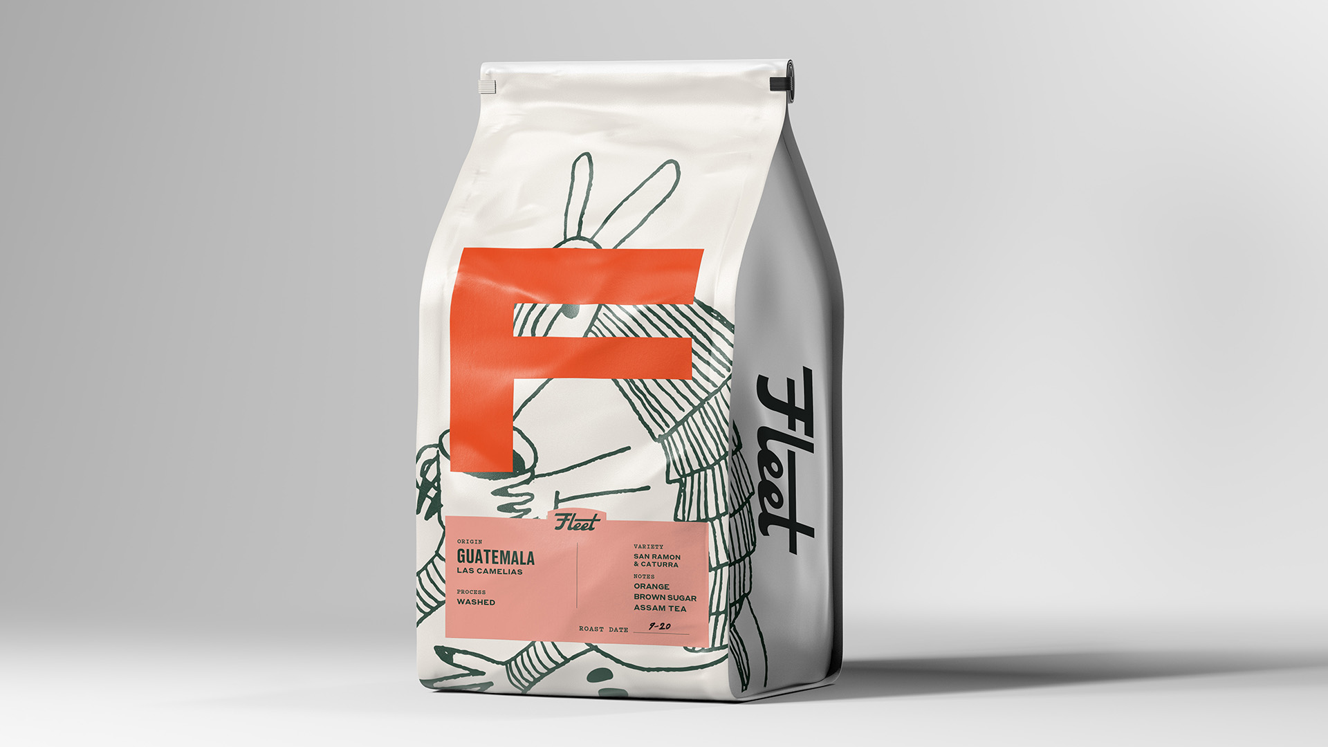
Designed by SAUCEHAUS, Fleet Coffee’s packaging offers a bold, oversized “F” in striking colors like red and turquoise, making it highly recognizable and memorable. It’s hard not to miss a gigantic “F.”
The minimalist white background provides a clean canvas that emphasizes the hand-drawn illustrations, adding a playful touch without overwhelming the design. The back of the packaging complements the front with a cohesive pop of color and elegant script typography, creating a balanced and personal feel. This thoughtful combination of boldness, clarity, and warmth makes the packaging visually appealing and highly functional in both retail and at-home settings.