Flour + Water Evolves Its Identity With Office

Flour + Water Evolves Its Identity With Office


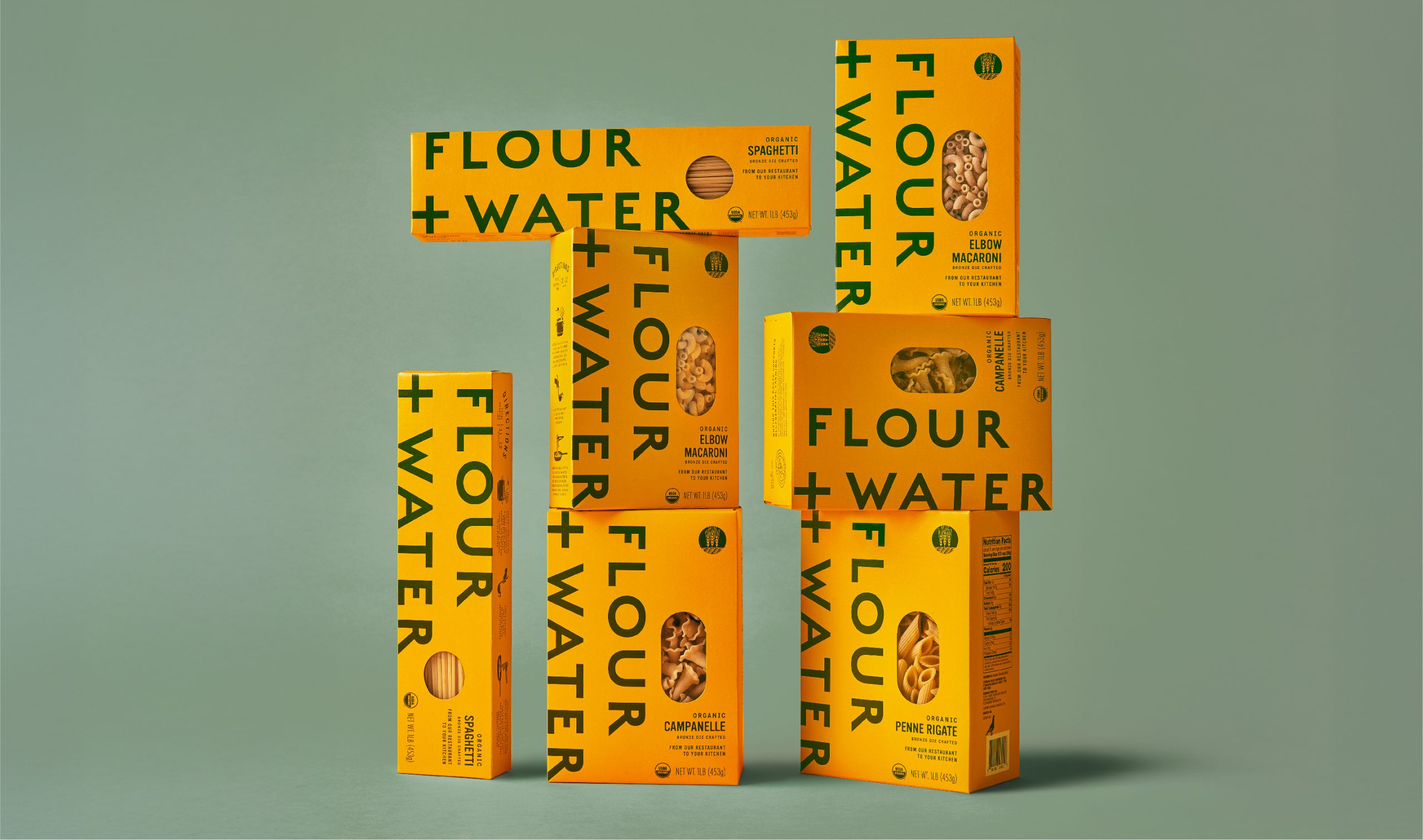
The redesigned Flour + Water packaging by Office emphasizes boldness and clarity with oversized forest green typography on a vibrant yellow backdrop, replacing the previous white typography for improved shelf impact and differentiation.

The vertical logo orientation, where possible, maximizes visibility, while larger viewing windows highlight the pasta’s artisanal texture. Thoughtful details, such as a hand-drawn illustration of the restaurant, chefs’ signatures, and a QR code linking to recipes, deepen the connection to the brand’s culinary roots.

 Jason Schulte, Founder & Executive Creative Director of Office gave us some insight into the redesign below.


Source link

Get Packaging Industry News updates

Get the most critical Packaging Industry news in your email each week.


We promise no spam email will send you.

Leave a Reply

Your email address will not be published. Required fields are marked *

Related Articles
Aran Group's MonoFlex Earns Gold Award at Worldstar Packaging Awards
Barbara RuckerMay 19, 2026

Aran Group’s MonoFlex bag-in-box solution has received the Gold Award in the “Packaging that…

SPG Opens Innovation Center in Silicon Valley
Barbara RuckerMay 19, 2026

SPG has announced the opening of its Innovation Center in Silicon Valley, a collaborative…

M.A.D. Foods Launches Pouch Packaging for Culinary Fats
Barbara RuckerMay 19, 2026

Setting aside the established relationship of fats to pouches, M.A.D. Foods has launched a…

Techlan Ltd and HERMA UK Advance Circular Solutions for Release Liner Waste
Barbara RuckerMay 19, 2026

Silicone-coated release liner has long been one of the label industry’s most persistent waste…