Some of the” deep” strategic insights that guide much of branding are occasionally comical, although not without some kernel of truth behind them.
For instance, apparently, the kids can’t read cursive anymore because many of them are no longer taught in school how to make loopy, conjoined words in fancy script. That was the idea behind the Eddie Bauer redesign a few years ago, the results of which were mostly met with a yawn. Similarly, Johnson & Johnson’s logo redesign in 2023 was intended to evolve with the times and give them a more human appearance; in reality, it felt cold and clinical and destroyed much of their brand equity.
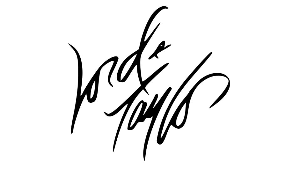
A year earlier, in 2022, the nearly 200-year-old department store Lord & Taylor also switched things up and implemented a mostly Helvetica-ish logo. Now, they’re returning to their original wordmark designed by architect Andrew Geller. In a world of neverending redesigns and ceaseless overthought reimagining of brand, the new owners in Regal Brands Global deserve a tip of the cap—if it ain’t broke, don’t fix it.