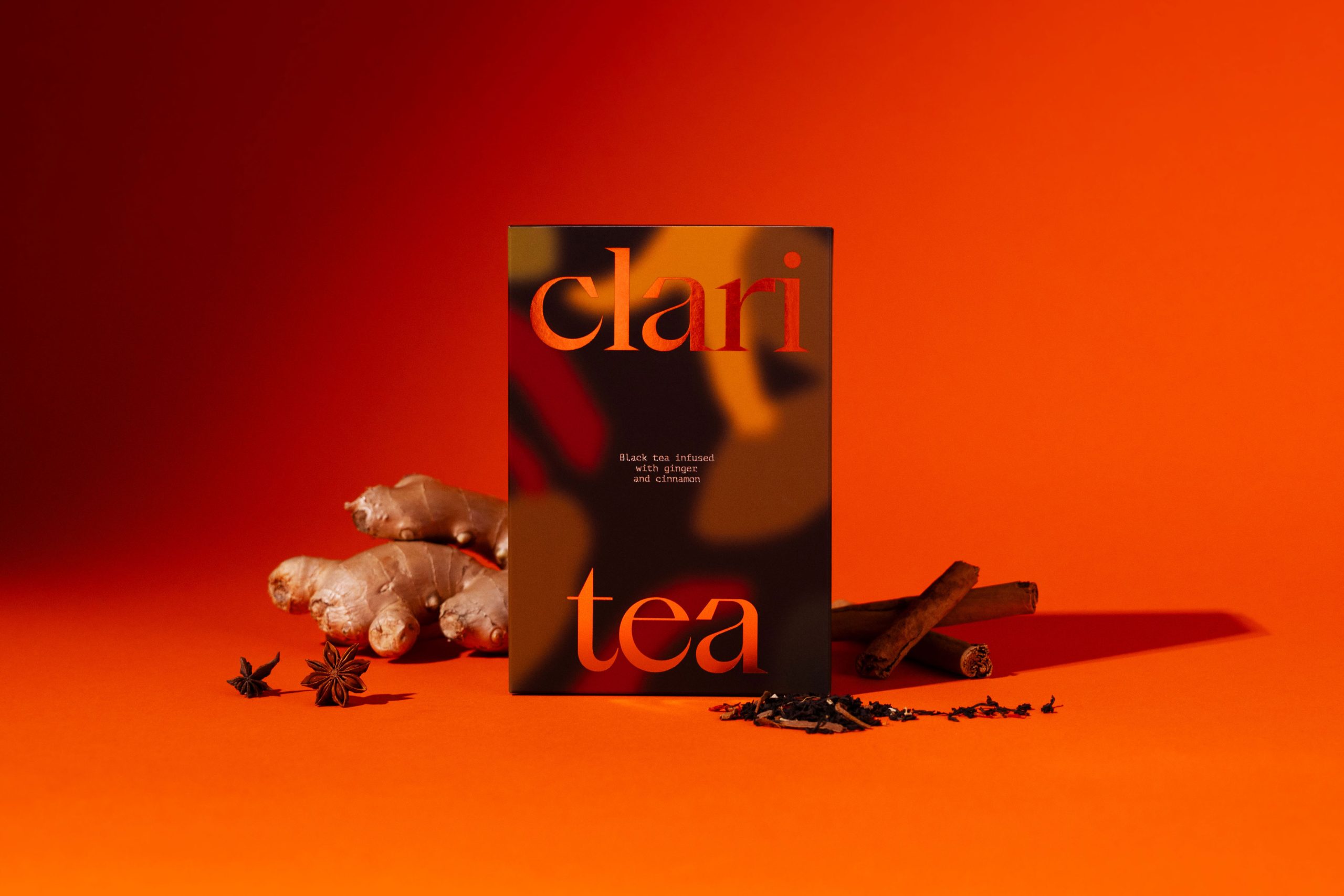
Floodlight designed Claritea’s packaging with an approach that blends warmth and sophistication. The almost tortoiseshell-inspired pattern adds depth and movement to the design, while the bold orange hue gives it a sense of energy without overwhelming the overall aesthetic.
The typography is clean and elegant, resulting in packaging that feels just as at home on a kitchen countertop as in a high-end retail space, ideal for an internal project meant to gift to clients.