IMPOSSIBREW’s Packaging Is Bold And Blocky

IMPOSSIBREW’s Packaging Is Bold And Blocky


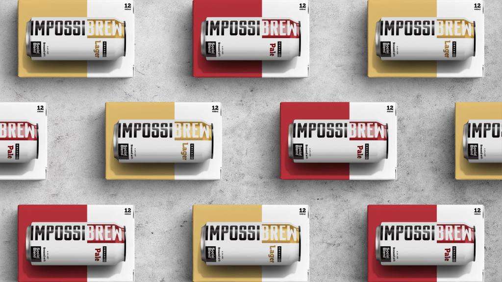
Derke&Eric’s design for Impossibrew leans into bold contrast and structured simplicity. The black-and-white split-block layout makes the typography pop, while the oversized can graphic on the outer box reinforces brand recognition.

The color accents, gold for lager, red for pale ale, add just enough visual hierarchy without taking away from the minimal design. The approach feels industrial yet playful, perfect for a straight-to-the-point low-alc beer.

Jon Gibbs, Managing Director, Derek and Eric, shares more about the design process below.


Source link

Get Packaging Industry News updates

Get the most critical Packaging Industry news in your email each week.


We promise no spam email will send you.

Leave a Reply

Your email address will not be published. Required fields are marked *

Related Articles
Sappi to Showcase Sustainable Tea Packaging at interpack
Barbara RuckerApr 15, 2026

At this year’s interpack, Sappi will be highlighting its latest innovations in sustainable tea…

Amcor Invests in New Printing Line at Hardenberg Facility
Barbara RuckerApr 15, 2026

Amcor, a global leader in developing and producing responsible packaging solutions, has made a…

Tessas Eplegård Cider Explores Honest, Farm-Friendly Storytelling
Barbara RuckerApr 15, 2026

While the rest of the cider world is leaning into rustic scripts and moody…

Pasta Fortuna Tells the Story of a Mother’s Love and a Land of Tradition
Barbara RuckerApr 15, 2026

There’s no denying that the CPG design world is deep in its maximalist renaissance,…