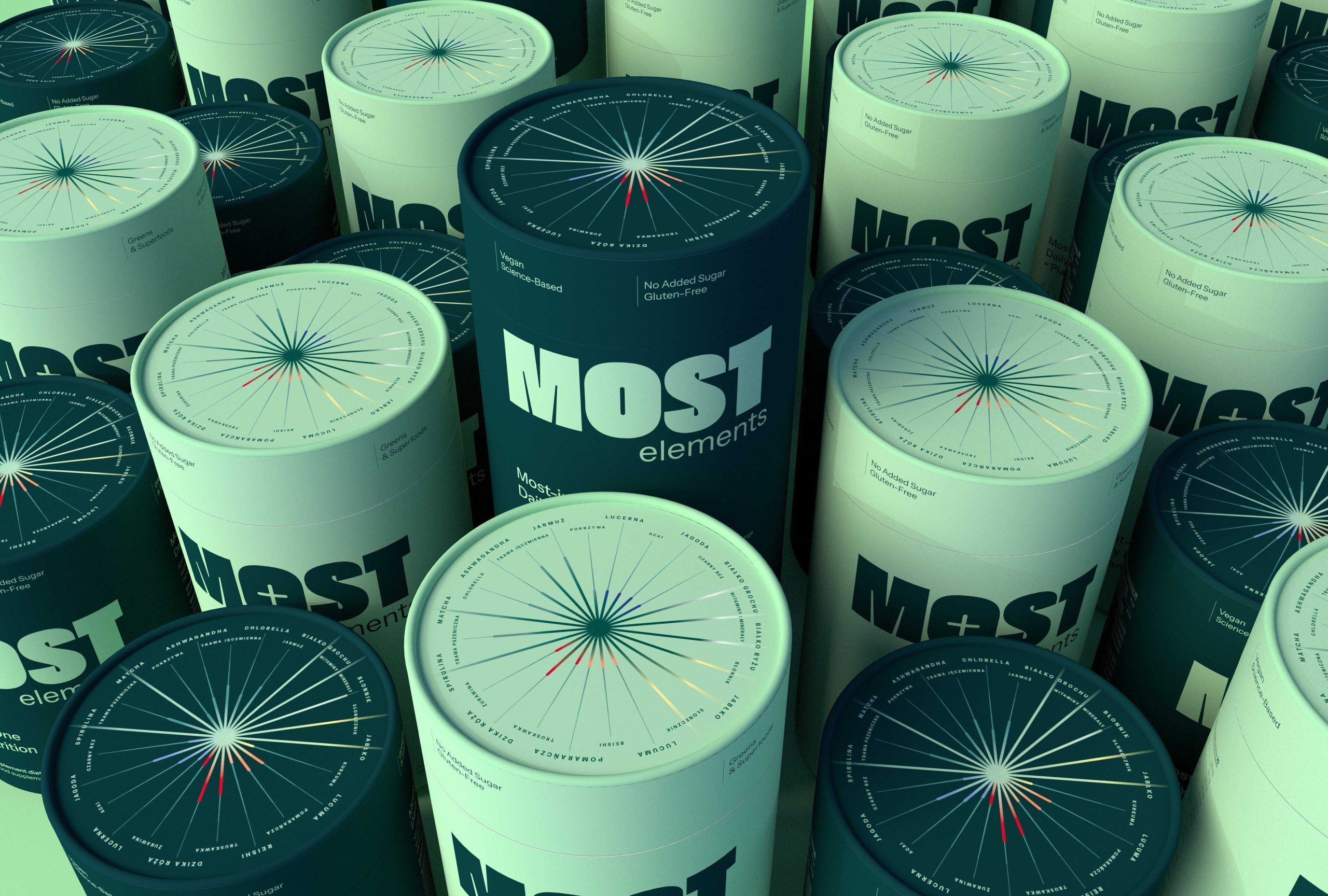
Podpunkt Studio packaging for MOST Elements leans into a clean, structured aesthetic with bold typography and a monochrome palette split between light and dark tones. The oversized block lettering steers attention, while the plus symbol subtly reinforces the product’s nutritional benefits.
The circular diagram on the lid suggests a data-driven approach, possibly mapping ingredients or benefits. The combination of minimalism and scientific cues gives the packaging an intentional, no-frills look that prioritizes clarity and function.