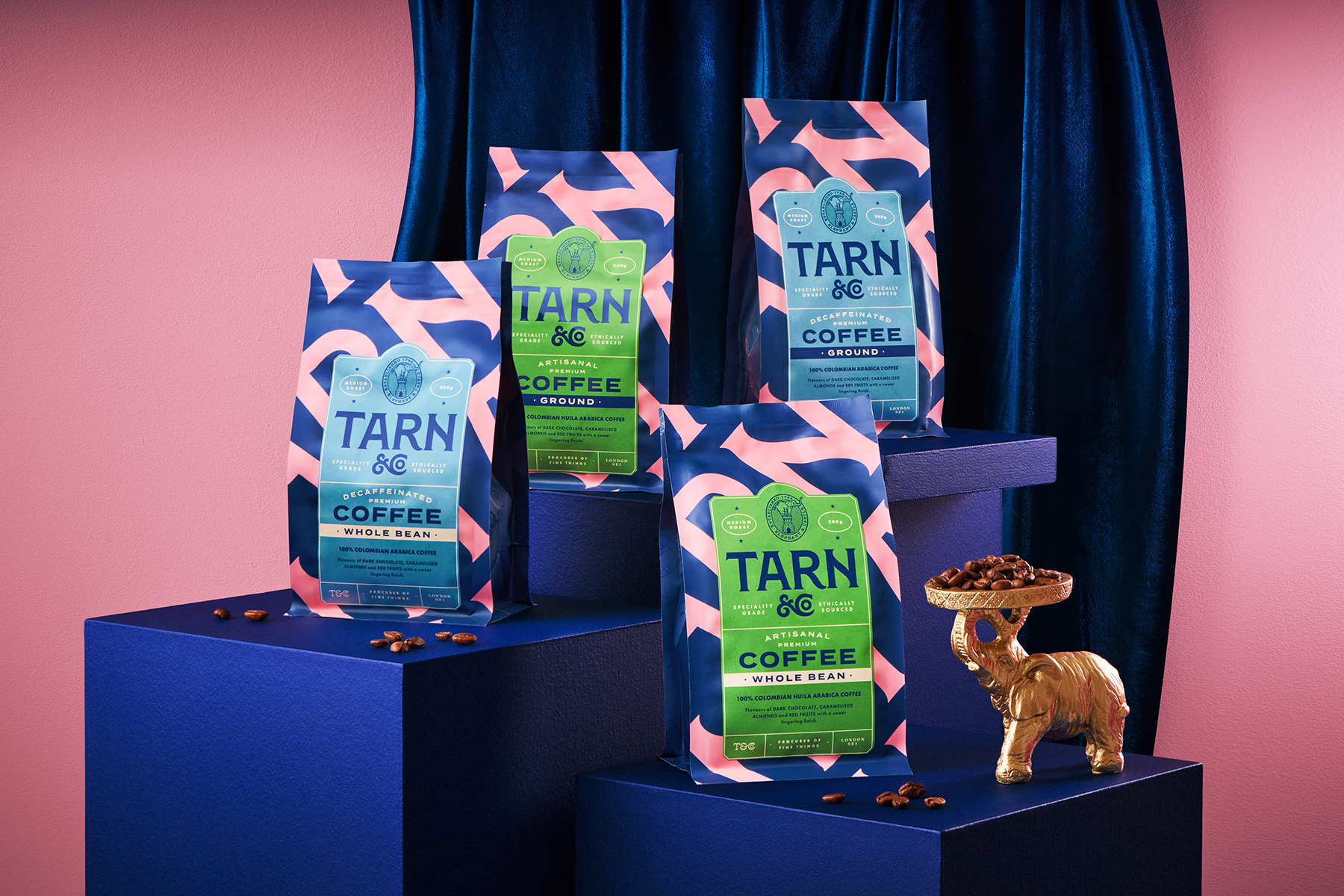
The Cabinet’s packaging for Tarn features chunky, serif type, making it feel grounded, but you’ll also find a mix of deep blue, hot pink, and electric green that stands out without feeling too chaotic.
Each format—tins, pods, and bottles—sticks to the same graphic system, making it feel cohesive across categories. The bold, graphic shapes echo traditional patterns but land more like a cool boutique café than anything overly basic.