Poniente’s Label Design Channels the Wind

Poniente’s Label Design Channels the Wind


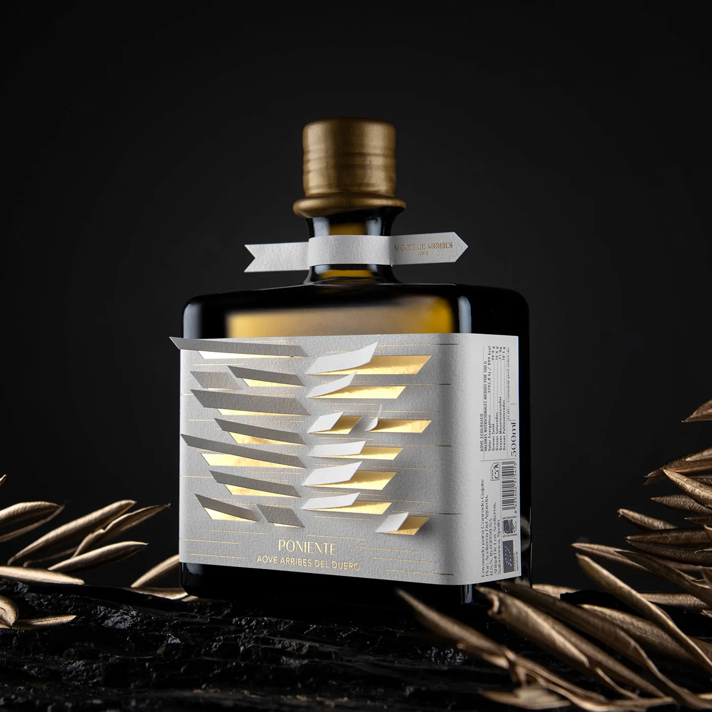
Poniente’s packaging, designed by Javier Garduño, turns olive oil into an object worth displaying. The label is cut and folded to mimic wind-swept olive leaves, a nod to the “Viento de Arribes” (wind of Arribes).

Gold foil peeks through each slit, catching the light and adding movement. The bottle itself is square and matte, grounding the ethereal design. Typography is minimal and placed with precision, letting the tactile paperwork tell the story. It’s subtle but incredibly sculptural.

Javier Garduño dives into the design process below.


Source link

Get Packaging Industry News updates

Get the most critical Packaging Industry news in your email each week.


We promise no spam email will send you.

Leave a Reply

Your email address will not be published. Required fields are marked *

Related Articles
GII takes minority stake in food packaging company Hotpack
Barbara RuckerMay 19, 2026

The food packaging company is planning to launch a new plant in Al Kharj,…

Takashi Murakami Brings His Signature Flower Power To Dom Pérignon
Good Grains Makes Cereal Worth Trusting
Barbara RuckerMay 19, 2026

Good Grains by Gel proves that organic cereal can be just as visually exciting…

Last resort Alert: Cut Dr. Wunderer’s Wine Label Into Pieces 
Barbara RuckerMay 19, 2026

Wunderer by Alessandri Design hand-cuts every label with a scalpel and reassembles it in…