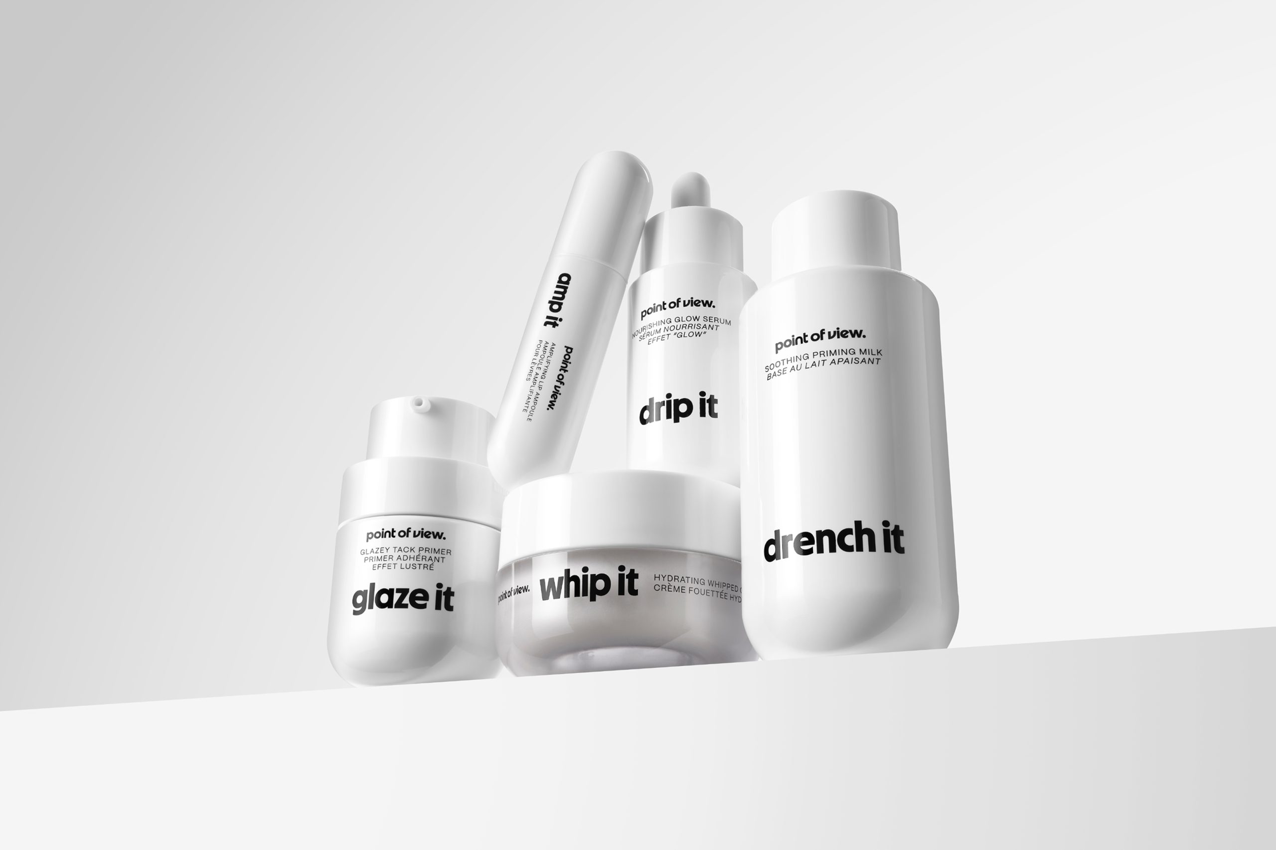
Point of View’s packaging, designed by Established, leans all the way into playful language. Each product name, including “whip it,” “glaze it,” and “amp it,” is typeset in bold lowercase sans serif. The stark black-and-white palette gives the naming structure room to shine without distraction.
Additionally, the lineup is sleek and intentional, from pill-like bottles to rounded jars and minimal droppers. It’s skincare branding that’s designed with editorial clarity.
Sam O’Donahue, Co-Founder of Established, dives into the intention behind the design below.