Borige Opts For Elegantly Bold Tins and Oversized type

Borige Opts For Elegantly Bold Tins and Oversized type


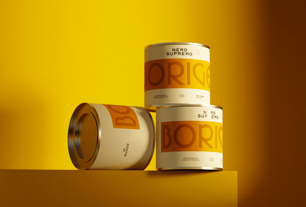
Borige’s packaging, designed by Omar Ayman, strips things back without feeling boring. The oversized type wraps around the can in a bold crop, with the word “Borige” bleeding into the background in a soft tonal contrast. Flavor names like “Nero Supremo” and “Veluto Nero” sit centered above, in a lighter, almost Swiss-style font pairing.

The wide, squat tin gives it a bit of industrial pantry appeal, while the sunny yellow, green, and gray color blocks keep it feeling punchy without trying too hard. The design is simple, but because of the creative small details, it absolutely stands out.


Source link

Get Packaging Industry News updates

Get the most critical Packaging Industry news in your email each week.


We promise no spam email will send you.

Leave a Reply

Your email address will not be published. Required fields are marked *

Related Articles
rePurpose Global Launches Packaging Simulator in Light of New Legislation
Barbara RuckerJun 26, 2026

rePurpose Global, the world’s leading Packaging Compliance and Sustainability Platform, has announced the launch…

Update to California SB 343 Recognizes Carton Recyclability
Barbara RuckerJun 26, 2026

Following a thorough review of additional information regarding new carton sortation for recycling across…

From Screen to Shelf: Why Context Wins in Real-World Packaging Design
Barbara RuckerJun 26, 2026

There’s a simple truth brands need to hear: if your packaging only works on…

FIFA’s ‘Brand Protection’ Inspires Heinz’s Latest Taped-Over Promotion
Barbara RuckerJun 26, 2026

FIFA’s “brand protection” policy forces stadiums to cover up any brand’s name and logo…