Noise Beer’s Dizzying Label Will Make You Seasick

Noise Beer’s Dizzying Label Will Make You Seasick


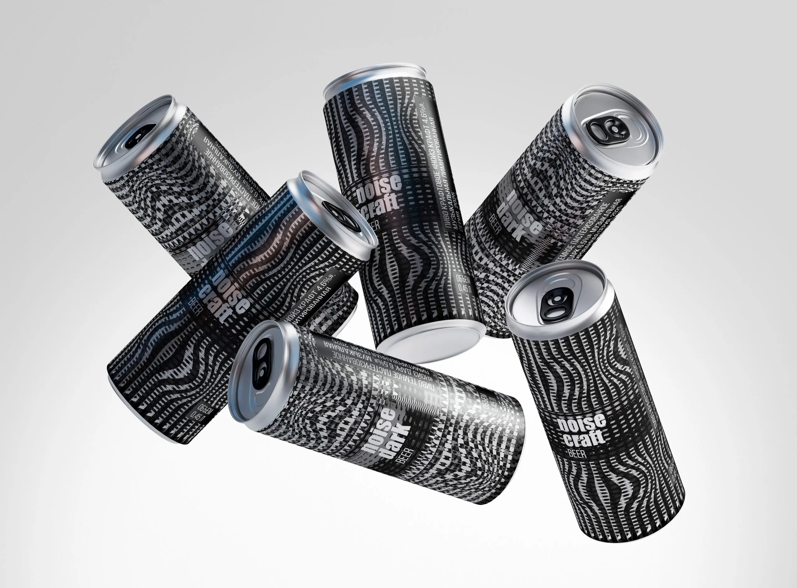
Noise Beer’s packaging, designed by Kate Minchenok, feels like looking at a glitchy graphic rave. The black-and-white cans are wrapped in optical noise patterns that pulse with movement, each slightly different, creating a visual rhythm that matches the name.

The typography is all lowercase and unapologetically bold, stacked neatly in white against the chaos, which helps the label stay legible amid the static. It’s the kind of design that catches your eye in a fridge lineup and refuses to let go.


Source link

Get Packaging Industry News updates

Get the most critical Packaging Industry news in your email each week.


We promise no spam email will send you.

Leave a Reply

Your email address will not be published. Required fields are marked *

Related Articles
IDFA Seeks Temporary Exemptions for Dairy Packaging under California’s SB 54
Barbara RuckerJun 27, 2026

The International Dairy Foods Association (IDFA) on Friday urged the Packaging Producer Responsibility Advisory…

rePurpose Global Launches Packaging Simulator in Light of New Legislation
Barbara RuckerJun 26, 2026

rePurpose Global, the world’s leading Packaging Compliance and Sustainability Platform, has announced the launch…

Update to California SB 343 Recognizes Carton Recyclability
Barbara RuckerJun 26, 2026

Following a thorough review of additional information regarding new carton sortation for recycling across…

From Screen to Shelf: Why Context Wins in Real-World Packaging Design
Barbara RuckerJun 26, 2026

There’s a simple truth brands need to hear: if your packaging only works on…