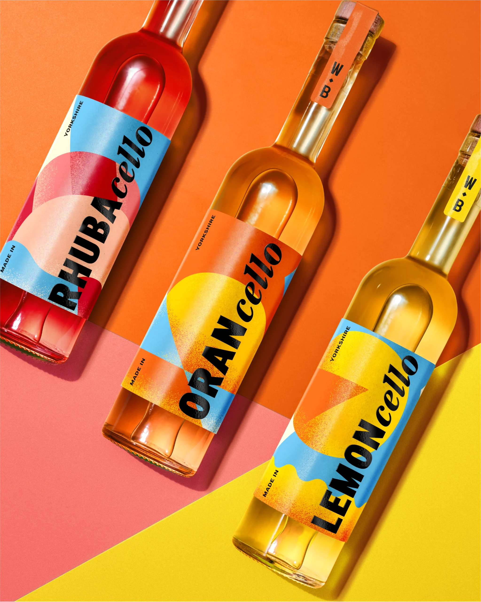
Wolfe Bros’ new lineup of Cello liqueurs, including Lemon, Rhubarb, and Orange, leans into big, bright maximalism with packaging that feels like summer in a bottle. Designed by OurCreative, each label uses large abstract shapes and a punchy high-contrast palette that mirrors the sharpness of the liquid inside.
The name breaks across the wrap in chunky, curved type, allowing “cello” to repeat like a call-and-response. From the slanted wrap to the extra-wide color blocks, it’s designed to stand out from every possible angle. Fruit liqueurs aren’t often taken seriously, but this design style ensures they’re viewed as a sophisticated yet playful take on the “cello” concept.
Joe Wallis, Design Director at OurCreative, dives into the design process below.