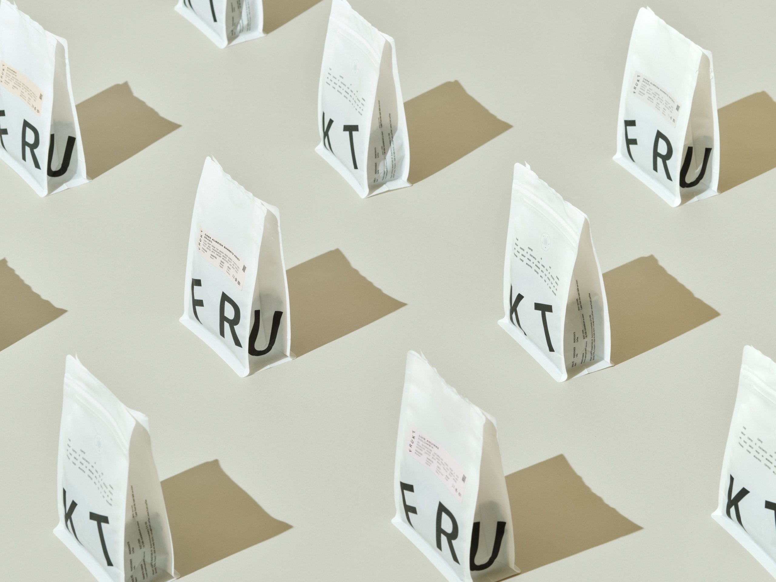
FRUKT Coffee Roasters’ minimalist packaging, designed by Tomi Leppänen, embraces the age-old graphic design cliché “make the logo bigger” and manages to create a striking visual impact. This approach allows for various playful word and letter combinations, filling retail shelves with dynamic designs.
Bold black typography on a white background ensures the brand’s name stands out, while the use of white paper cups and matte pouches emphasizes quality and sustainability. The resealable pouches also ensure the coffee’s freshness.