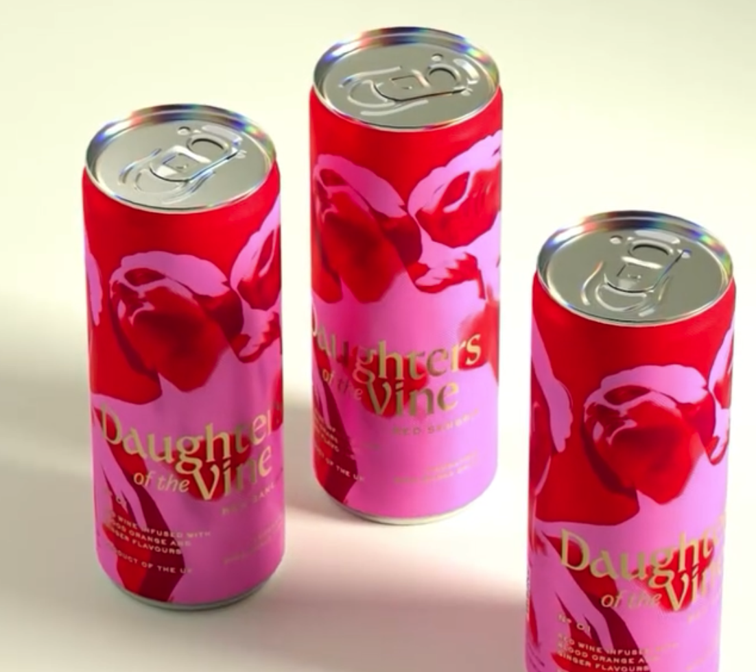
Daughters of the Vine’s packaging by Bulletproof feels like a bold floral daydream splashed across a can. Crimson and pink blooms swirl around the sleek silhouette, creating a painterly backdrop.
The gold, serif typography adds a splash of glamour, catching the light with each tilt. The design balances softness and confidence, nodding to the expressive spirit of the brand.
It’s basically a bouquet you can crack open.