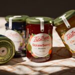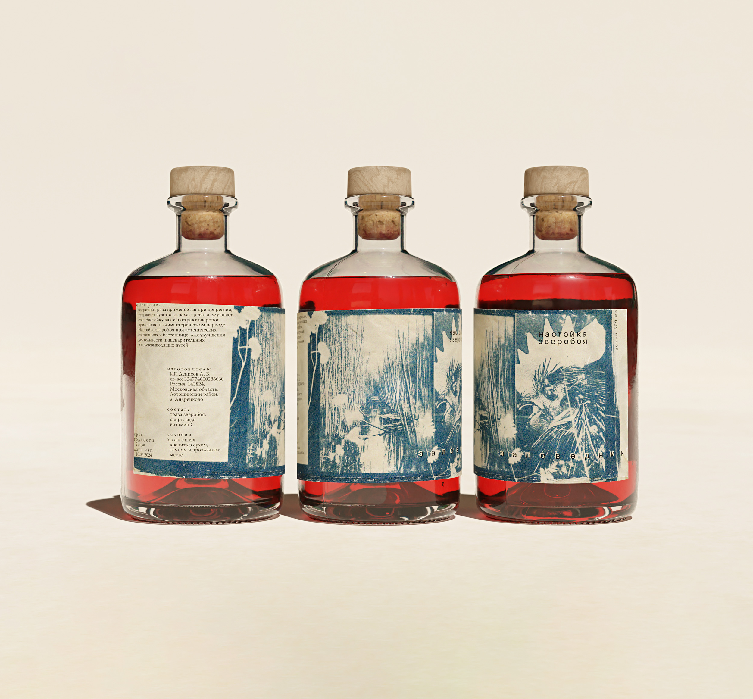
Zapovednik’s packaging by omsky studio uses sunlight-exposed cyanotypes to turn rural snapshots into textural, documentary-style visuals. Each label looks like a printed memory, it’s low-fi, quiet, and deliberate.
The typography is almost utilitarian letting the imagery carry most of the weight. With mismatched bottle shapes and jars, the system avoids uniformity, leaning into tactility and imperfection. It’s more field journal than anything, and that’s exactly what makes it stand out.