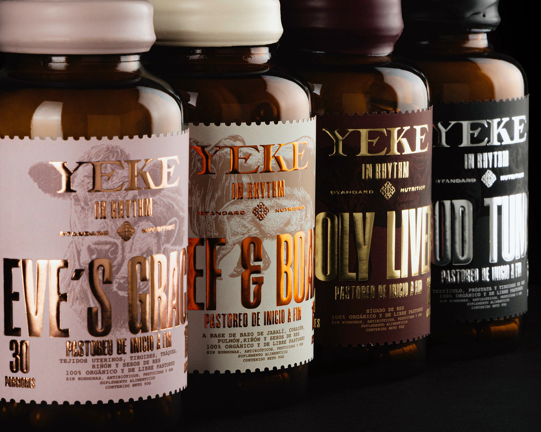
Yeke In Rhythm’s packaging, designed by Monotypo Studio, leans into bold, oversized typography that dominates the label. Meanwhile, metallic foils in copper, gold, and silver create high-contrast highlights against deep, muted backgrounds. The brown glass bottles add a tactile, apothecary edge, while the serrated label edges nod to precision and craft. Each variant has a rich color palette, making the lineup visually cohesive yet individually distinct.