Angel Oak’s Packaging Fuses Bold Geometry with Natural Refinement

Angel Oak’s Packaging Fuses Bold Geometry with Natural Refinement


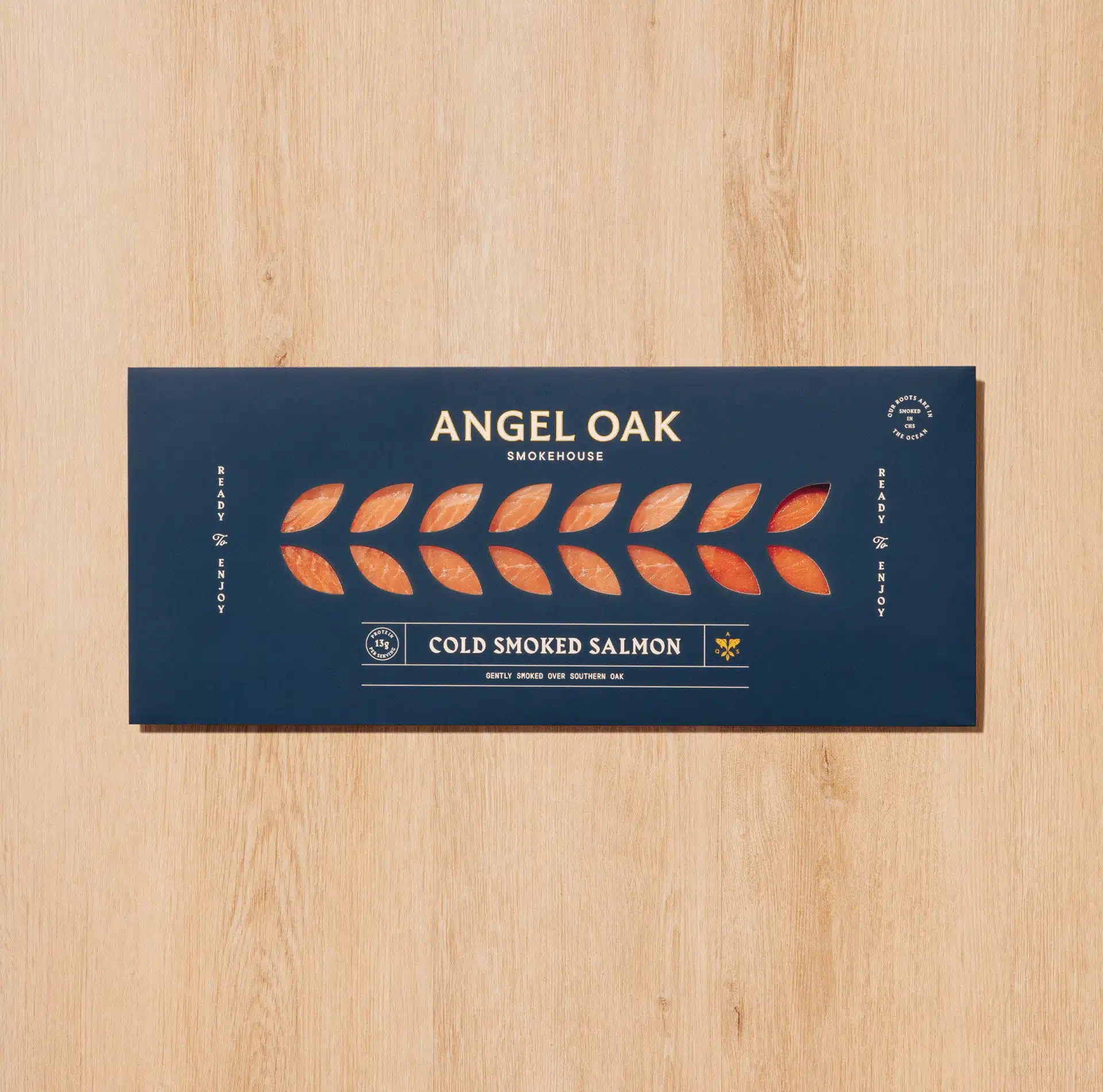
Angel Oak’s packaging, designed by SDCO Partners, uses geometric layouts, clean typography, and layered illustrations to give the smoked salmon brand a distinct shelf presence.

The logomark and oval icon work as strong anchors across bottles, boxes, and digital touchpoints, while the muted color palette keeps the identity grounded. The design system, executed with consistency across labels, signals both craft and clarity, making Angel Oak instantly recognizable without overcomplicating the story.


Source link

Get Packaging Industry News updates

Get the most critical Packaging Industry news in your email each week.


We promise no spam email will send you.

Leave a Reply

Your email address will not be published. Required fields are marked *

Related Articles
DS Smith and SOMFY roll out recyclable cardboard packaging
Barbara RuckerMay 21, 2026

The inserts are produced from Kraft EE (Electrical Grade) corrugated board. Credit: DS Smith…

Eme Skincare Is Centered On Simplicity And Balance
Barbara RuckerMay 21, 2026

Eme Skincare’s frosted glass tubes, square caps, and swirly calligraphic wordmark bring a fine…

Buddy-Buddy Introduces a Scent-Coded System To Element Brooklyn
Barbara RuckerMay 21, 2026

Buddy-Buddy rebuilds Element Brooklyn around a chiseled serif wordmark and scent-coded color system designed…

India’s apex court questions shifting state rules for liquor packs
Barbara RuckerMay 21, 2026

The plea was moved by the NGO Community Against Drunken Driving. Credit: evgris /…