GOYO’s Tea Packaging Delivers Clarity, Calm, and Style

GOYO’s Tea Packaging Delivers Clarity, Calm, and Style


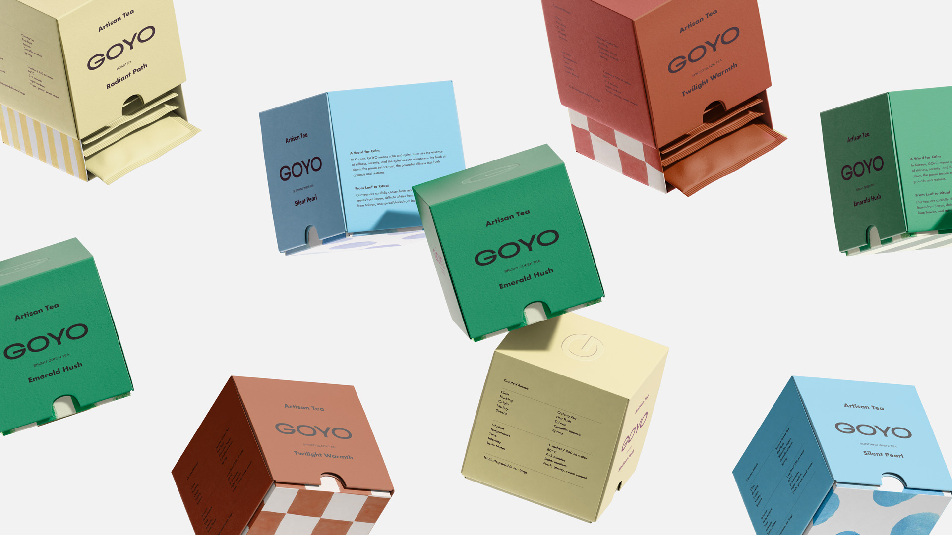
GOYO’s packaging by Better than Sunday features little cubes of color with simple sans-serif typography front and center. The sides reveal playful patterns, such as stripes, checks, and dots, that hint at a flavor personality and make stacking them visually satisfying.

The tear-out front panel doubles as a dispenser, adding functionality without letting go of the clean look. Inside, individually wrapped sachets match the box color, creating a cohesive. It’s cute but not dowdy, and makes tea drinking approachable to a younger crowd.


Source link

Get Packaging Industry News updates

Get the most critical Packaging Industry news in your email each week.


We promise no spam email will send you.

Leave a Reply

Your email address will not be published. Required fields are marked *

Related Articles
Geopolitical risk reshapes packaging investment case
Barbara RuckerApr 15, 2026

Investors are shifting their focus beyond traditional growth metrics to examine how well companies…

Sappi to Showcase Sustainable Tea Packaging at interpack
Barbara RuckerApr 15, 2026

At this year’s interpack, Sappi will be highlighting its latest innovations in sustainable tea…

Amcor Invests in New Printing Line at Hardenberg Facility
Barbara RuckerApr 15, 2026

Amcor, a global leader in developing and producing responsible packaging solutions, has made a…

Tessas Eplegård Cider Explores Honest, Farm-Friendly Storytelling
Barbara RuckerApr 15, 2026

While the rest of the cider world is leaning into rustic scripts and moody…