PepsiCo has announced that Lay’s is unveiling its most significant global brand transformation in nearly a century with a new visual identity and packaging that will roll out globally.
“More than just a brand redesign, the new Lay’s visual identity, created by PepsiCo’s Design & Innovation team, now tells a story that speaks to its legacy of authenticity while honoring the potatoes’ journey from farm to bag, its commitment to using only quality ingredients, and the unmatched taste and flavor that people know and love,” PepsiCo says.
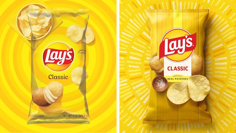
While the Lay’s logo has always featured a yellow sun, the team made the sun warmer and more distinct. Sun rays, or “Lay’s Rays,” beam from the logo, a nod to the light that helps potatoes grow.
Updated design elements that are ushering in the next era of Lay’s include:
- Lay’s Rays: The beams of light exuding from the Lay’s logo—known as Lay’s Rays—bring focus and energy to the heart of the new visual identity, paying homage to the sun that powers the quality ingredients inside every bag. Some rays, like those that appear on retail displays, advertisements, and more, were handmade using a potato stamping process, speaking to the brand’s core ingredient and offering natural texture and energy.
- Typeface: “The debut of a new custom typeface perfectly pairs with the iconic logo. Designed to echo the Lay’s modern yet joyful character, the handcrafted type unifies every touchpoint and drives the bold new visual identity forward,” PepsiCo says.
- Color palette: In addition to Lay’s signature sunny yellow, a refined color palette pulls hues from the ingredients of Lay’s recipes, including pickle green, hickory brown, savory red, and more.
- Backdrop: In the pack’s backdrop, the potato and other ingredients are positioned against wood grain slats, a nod to the farm crates that house Lay’s ingredients and the picnic tables where bags are often shared and enjoyed by friends and families.
- Chip Imagery: Against this inviting backdrop, enhanced photography showcases the quality and flavor of every Lay’s variety. Vivid, close-up visuals highlight the golden color, crisp texture, and seasoning of each chip, celebrating Lay’s quality from farm to shareable moment. “Even the flavor panel feels hand-applied, reinforcing the care behind every bag,” PepsiCo notes.