• Home
  • Packaging News
  • Telegraph Hill Gets a Red Hot Redesign and Ditches ‘Olive Oil Green’

Telegraph Hill Gets a Red Hot Redesign and Ditches ‘Olive Oil Green’

Telegraph Hill Gets a Red Hot Redesign and Ditches ‘Olive Oil Green’


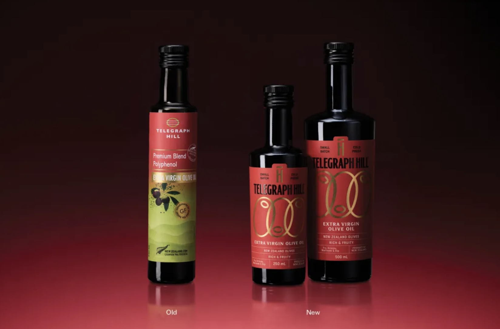
Telegraph Hill’s Refresh update by Onfire Design transitions from polite specialty food to a new packaging system that demands authority. The previous packaging was busy, but the new system pares back information and turns to bold, vertical typography with generous spacing.

A red base anchors the design, while gold linear motifs reference olive branches and flow without illustration heaviness. Dark secondary labels add hierarchy. The result is premium and confident, and let’s be honest, the last thing we needed was another green olive oil packaging system. 


Source link

Get Packaging Industry News updates

Get the most critical Packaging Industry news in your email each week.


We promise no spam email will send you.

Leave a Reply

Your email address will not be published. Required fields are marked *

Related Articles
Shelf Life 110: Is The Most Effective Skincare…. Edible? 
Barbara RuckerMay 3, 2026

The “eat your skincare” trend has exploded from TikTok viral content into a multi-billion…

MM Board & Paper unveils new boxboard
Barbara RuckerMay 1, 2026

The new product is based on its work in virgin fibre cartonboard. Credit: MM…

Temple Bar’s Vodka Looks Like It Was Illustrated by Irish Mythology Itself
Barbara RuckerMay 1, 2026

Irish vodka is not a category that usually stops you in your tracks, or…

dummy-img
The Coffee Brand That Found Its Identity at Exactly 170 Degrees
Barbara RuckerMay 1, 2026

Café 170º by M+C Saatchi Spain turns a precise moment of coffee science into…