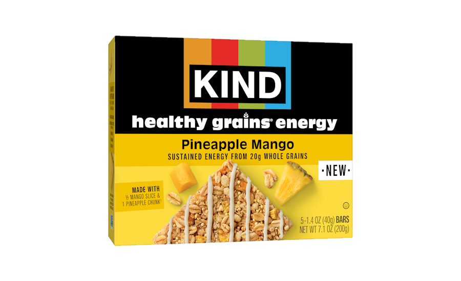
Mars’ Kind brand is launching a refreshed visual identity, featuring a new modernized logo and upgraded packaging inspired by the brand’s color bars. The design debuts with Kind’s Healthy Grains Energy Bars in new fruit-forward flavors this spring, and a full portfolio rollout over the next nine months. The updated logo hit Kind channels on May 1.
The key consumer insight going into this redesign was that Kind’s strongest DMS (distinctive memory structures) was its four color bars. The brand leveraged this insight to create a new logo that highlights the distinct color bars for a bolder, more vibrant look designed for modernity and iconicity, it says. Beyond the logo, the visual identity refresh continues on pack: new designs will feature a large logo, an unwrapped bar to highlight each products’ key ingredients and characteristics, and the functional benefits of each product line.
This new visual identity will be the start of many elements that will evolve to fit Kind’s purpose in their next 20 years as a brand, the company says.