Matcha Society Attempts To Build a New Visual Language for the Category

Matcha Society Attempts To Build a New Visual Language for the Category


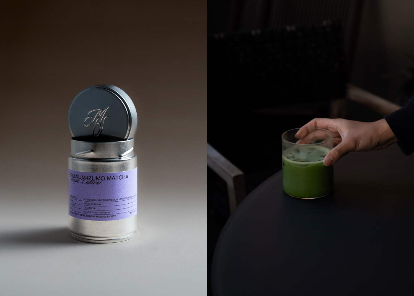
Matcha Society’s packaging, designed by perfectgraey, rejects ornamental tropes and instead uses brushed-metal tins that signal utility and freshness, borrowing from apothecary and Japanese tea storage traditions.

The typography pairs a clean, modern sans serif with a calligraphic script. A muted palette of moss green, charcoal, and silver creates a sparse layout and ingredient-forward hierarchy that sets it apart from decorative matcha brands that prioritize ceremony over clarity.


Source link

Get Packaging Industry News updates

Get the most critical Packaging Industry news in your email each week.


We promise no spam email will send you.

Leave a Reply

Your email address will not be published. Required fields are marked *

Related Articles
Aran Group's MonoFlex Earns Gold Award at Worldstar Packaging Awards
Barbara RuckerMay 19, 2026

Aran Group’s MonoFlex bag-in-box solution has received the Gold Award in the “Packaging that…

SPG Opens Innovation Center in Silicon Valley
Barbara RuckerMay 19, 2026

SPG has announced the opening of its Innovation Center in Silicon Valley, a collaborative…

M.A.D. Foods Launches Pouch Packaging for Culinary Fats
Barbara RuckerMay 19, 2026

Setting aside the established relationship of fats to pouches, M.A.D. Foods has launched a…

Techlan Ltd and HERMA UK Advance Circular Solutions for Release Liner Waste
Barbara RuckerMay 19, 2026

Silicone-coated release liner has long been one of the label industry’s most persistent waste…