Pálinka Bottles Up Budapest Without Getting Hung Up on Tradition

Pálinka Bottles Up Budapest Without Getting Hung Up on Tradition


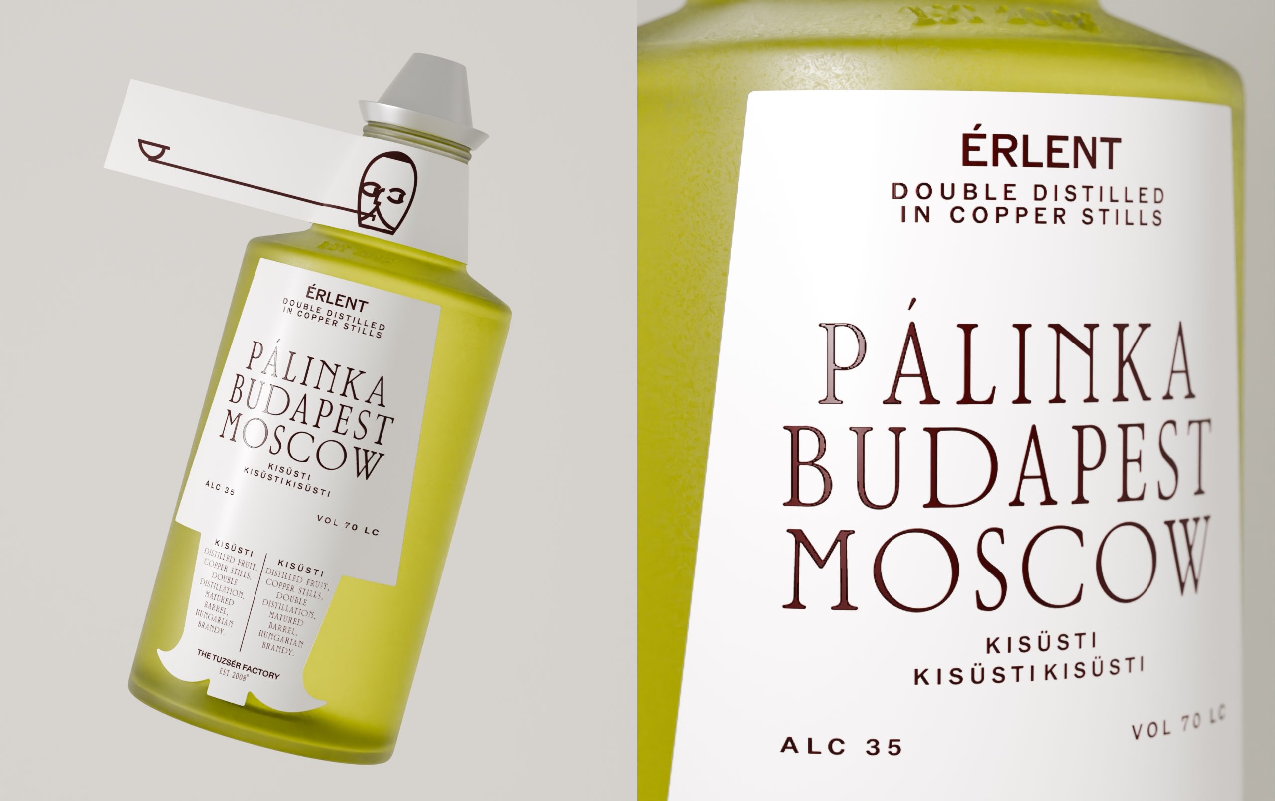
The squat bottle and horizontal neck tag look like industrial seals and archival labeling instead of a folkloric ornament. Evgeniya Tsoy’s concept packaging for the fruit vodka PÁLINKA pairs a crisp serif typeface with interesting spacing. The colors move from oxidized reds to apple greens, mapping fruit character and maturation, while the minimalist line illustration makes the category look intellectual, not rustic.




Source link

Get Packaging Industry News updates

Get the most critical Packaging Industry news in your email each week.


We promise no spam email will send you.

Leave a Reply

Your email address will not be published. Required fields are marked *

Related Articles
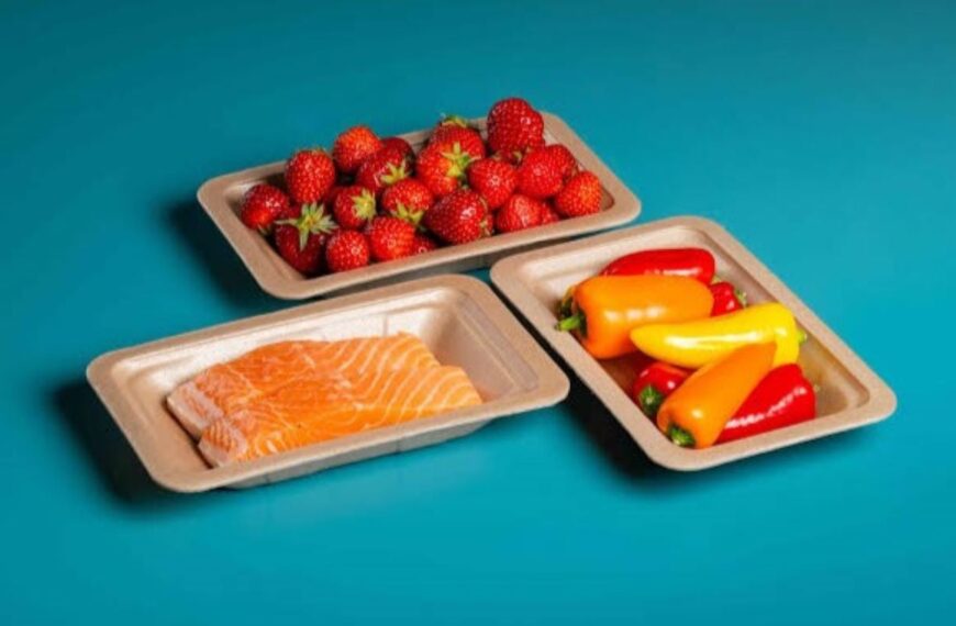
TotalEnergies Corbion commercialises compostable foam alternative
Barbara RuckerJul 9, 2026

TotalEnergies Corbion has started commercial sales of Luminy FOAM 50F, a polylactic acid (PLA)…

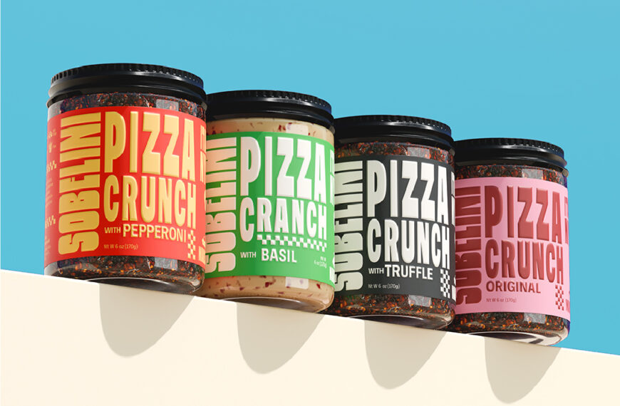
Sobelini Pizza Crunch Seasons Everything, Including the Shelf
Barbara RuckerJul 9, 2026

Chili crisp has a fun way with type. I don’t know if it’s because…

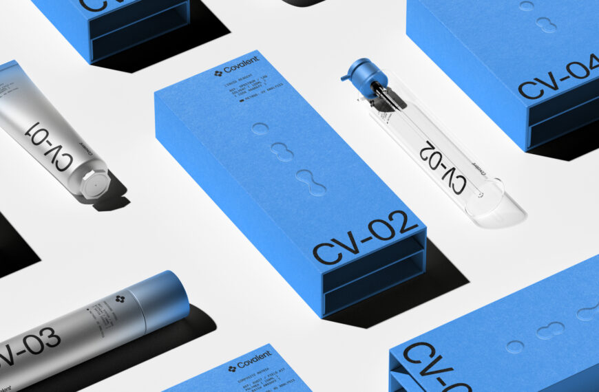
Covalent Centers Its Identity On Scientific Precision
Barbara RuckerJul 9, 2026

We’ve seen skincare packaging range from millennial pink to museum-worthy, sculptural, bright colors to…

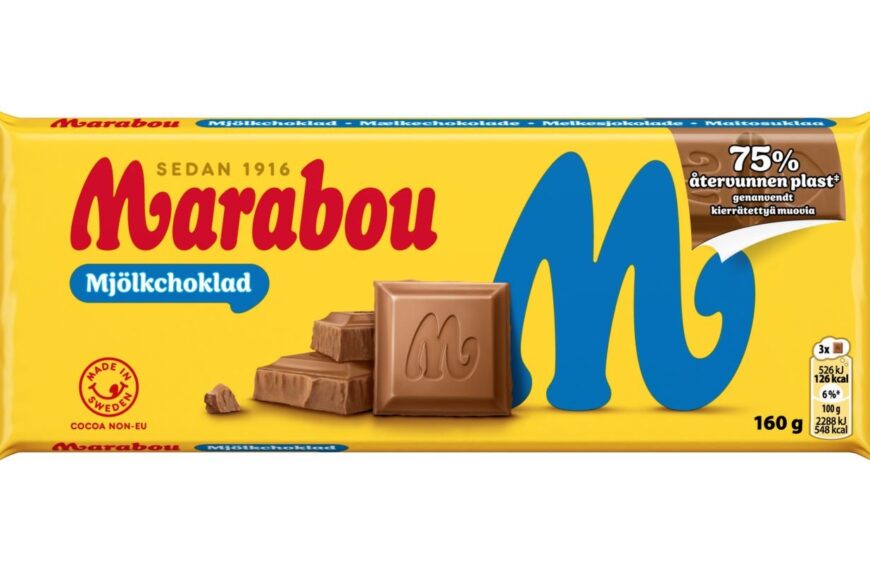
LYB forges industry collaboration for recycled Marabou chocolate packaging
Barbara RuckerJul 9, 2026

LyondellBasell (LYB), Amcor and various industry partners have developed a new wrapper for Marabou…