Squarely Rethinking Energy Bars With Bunker Bang

Squarely Rethinking Energy Bars With Bunker Bang


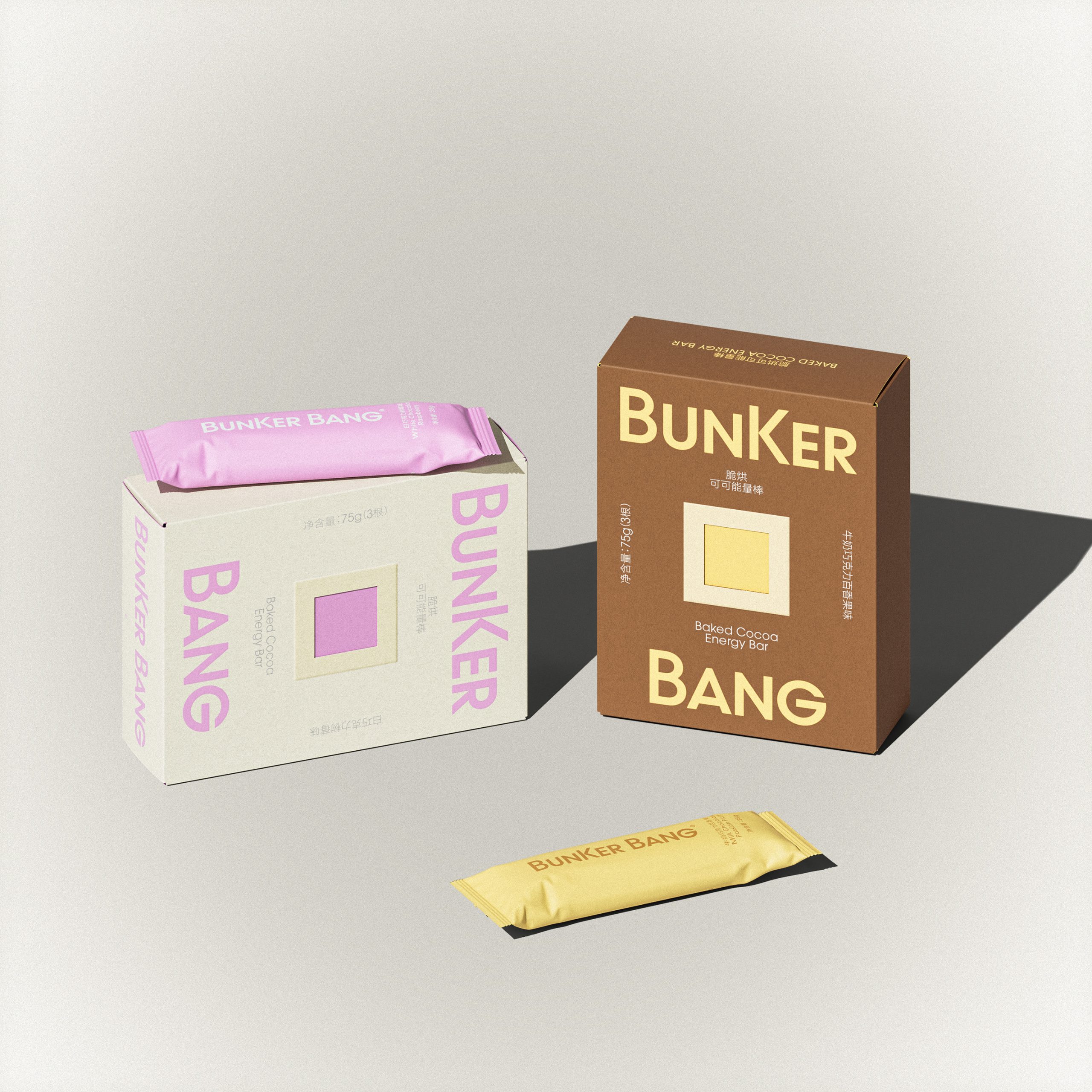
It all starts with a simple square.

Designed by 1To3. Design Lab for Bunker, the packaging takes inspiration from the ingredient cross-section of energy bars. This move turns something usually hidden inside the product into the hero of the brand story. The typography works in tandem with this clarity, using a modern sans serif that feels structured yet approachable, allowing the name Bunker Bang to sit confidently without overpowering the visual system. 

A low saturation palette of creams, cocoa browns, pistachio greens, and soft berry pinks connects directly to natural sources while also aligning with current trends toward calm, ingredient-led minimalism.


Source link

Get Packaging Industry News updates

Get the most critical Packaging Industry news in your email each week.


We promise no spam email will send you.

Leave a Reply

Your email address will not be published. Required fields are marked *

Related Articles
Cattyfeast Turns Cat Food Into Design Purrfection
Barbara RuckerApr 15, 2026

REWOT s.r.l. gave FIDOVET’s Cattyfeast gold foil cans and a saturated flavor-coded palette that…

The Return of the Stubby? Garage Beer Bets on Stout Bottles and 24-Can Buckets
Barbara RuckerApr 15, 2026

Garage Beer resurrects the stubby bottle and drops a 24-pack hardware bucket to stand…

Geopolitical risk reshapes packaging investment case
Barbara RuckerApr 15, 2026

Investors are shifting their focus beyond traditional growth metrics to examine how well companies…

Sappi to Showcase Sustainable Tea Packaging at interpack
Barbara RuckerApr 15, 2026

At this year’s interpack, Sappi will be highlighting its latest innovations in sustainable tea…