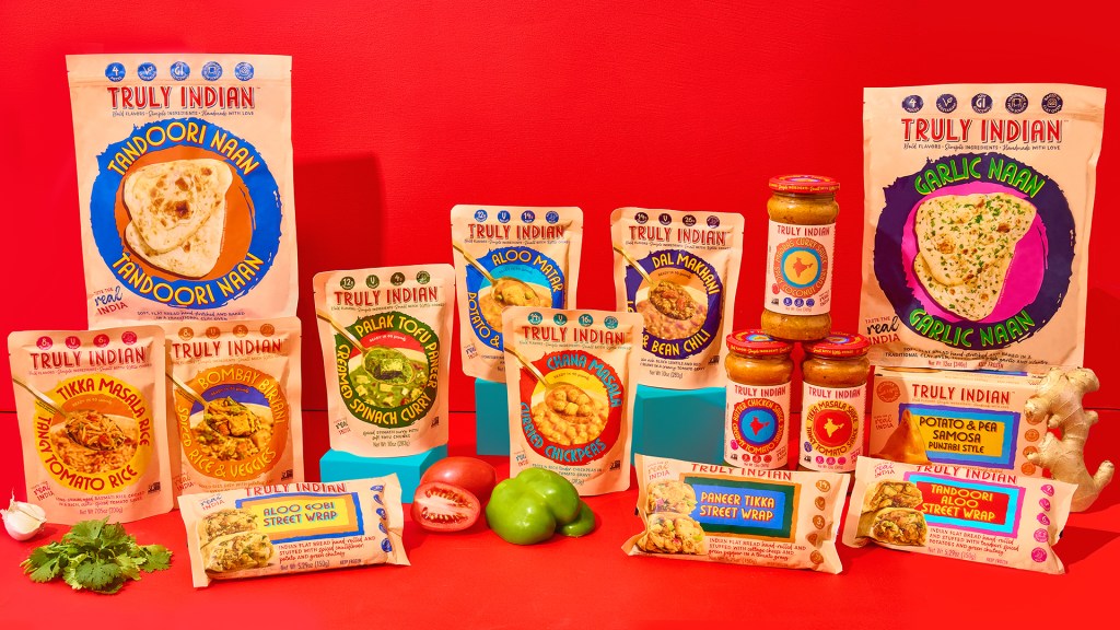
- ACB* transforms Truly Indian with a street food-inspired design rooted in hand-painted signage and expressive typography.
- Vibrant spice driven colors and textured layouts create a more dynamic and culturally rich presence in the frozen food aisle.
Some redesigns aren’t really even deserving of that description, with just a minor tweak here or there. But with Truly Indian, ACB* has flipped the entire packaging upside down and completely altered the brand. And for the better.
The new design draws from hand-painted signage and street food culture, creating a visual system that feels alive with texture and character. The typography has a hand-rendered quality that adds warmth but stays legible.