Gravita Pours Out a Clean Typographic Approach With Lan Wines Refresh

Gravita Pours Out a Clean Typographic Approach With Lan Wines Refresh


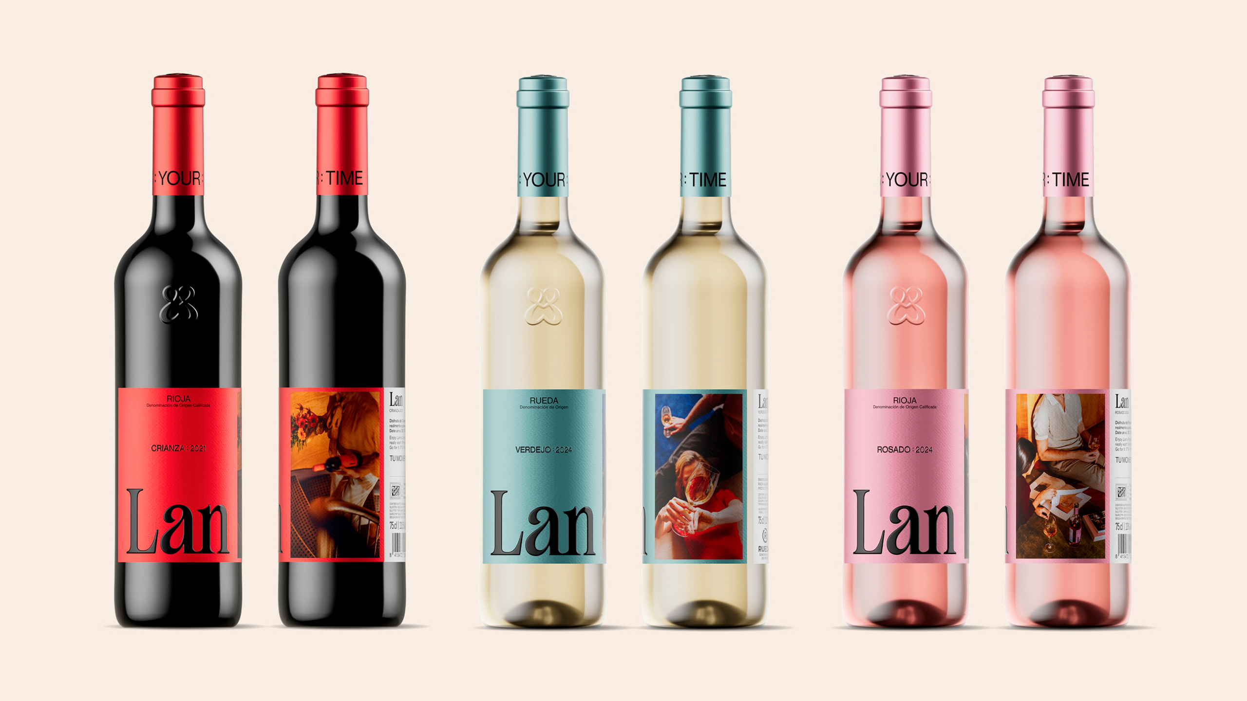
I’m all about design that sheds visual clutter in favor of sharper, more confident identities, and this before and after transformation captures that shift perfectly. 

For Bodegas Lan, GRAVITA moves away from the previous, dense label layouts toward something more focused. A single, enlarged “Lan” becomes the defining feature across the range. Color plays a more intentional role in the updated system, with each varietal expressed through clean, contemporary tones that bring clarity and cohesion to the lineup.


Source link

Get Packaging Industry News updates

Get the most critical Packaging Industry news in your email each week.


We promise no spam email will send you.

Leave a Reply

Your email address will not be published. Required fields are marked *

Related Articles
Zula Alpha Kilo Layers in Storytelling For Henry of Pelham’s Wine Labels
Barbara RuckerApr 9, 2026

Zulu Alpha Kilo for Henry of Pelham creates an interactive wine label using layered paper elements to…

You Gotta Give: Wildhawk’s Packaging May Cause Post-Shake Confidence
Barbara RuckerApr 9, 2026

Packaging that leans solely on bold, sans serif type and a duo of strong…

JKR’s Refresh For Bar Keeper’s Friends Adds Some Much-Needed Shimmer and Shine
Barbara RuckerApr 9, 2026

Bar Keeper’s Friend partnered with design agency JKR to execute a thoughtful brand refresh…

UPM and Mark Andy renew Americas agreement
Barbara RuckerApr 9, 2026

UPM materials will continue to be used at Mark Andy demonstration sites. Credit: UPM…