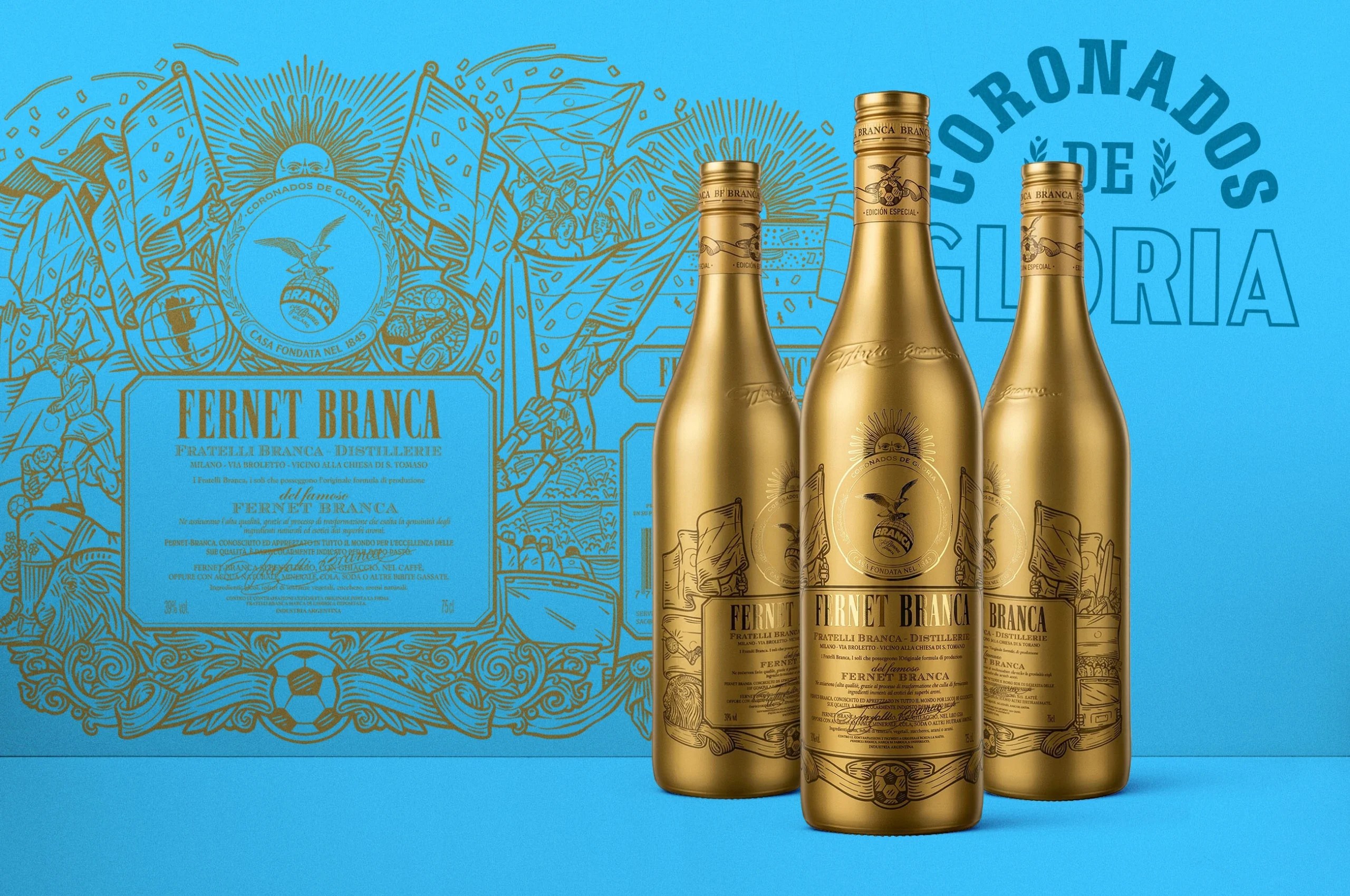
In the world of packaging design, there’s no shortage of limited-edition bottles. And there’s certainly no shortage of limited-edition World Cup packaging, but while most brands are slapping a sticker or quickly designed label and calling it a day, Fernet Branca’s World Cup edition, designed by Emi Renzi, went a completely different route by dipping the entire bottle in metallic gold.
The illustrations etched across the surface lean into traditional engraving and woodcut-style linework; all sun rays, eagles, ribbons, and crests look pulled straight from old-world Italian design, but there’s a soccer ball worked into the crest as a subtle nod to the occasion. This is what a limited edition design should feel like. It’s a transformation of an icon into something collectible.