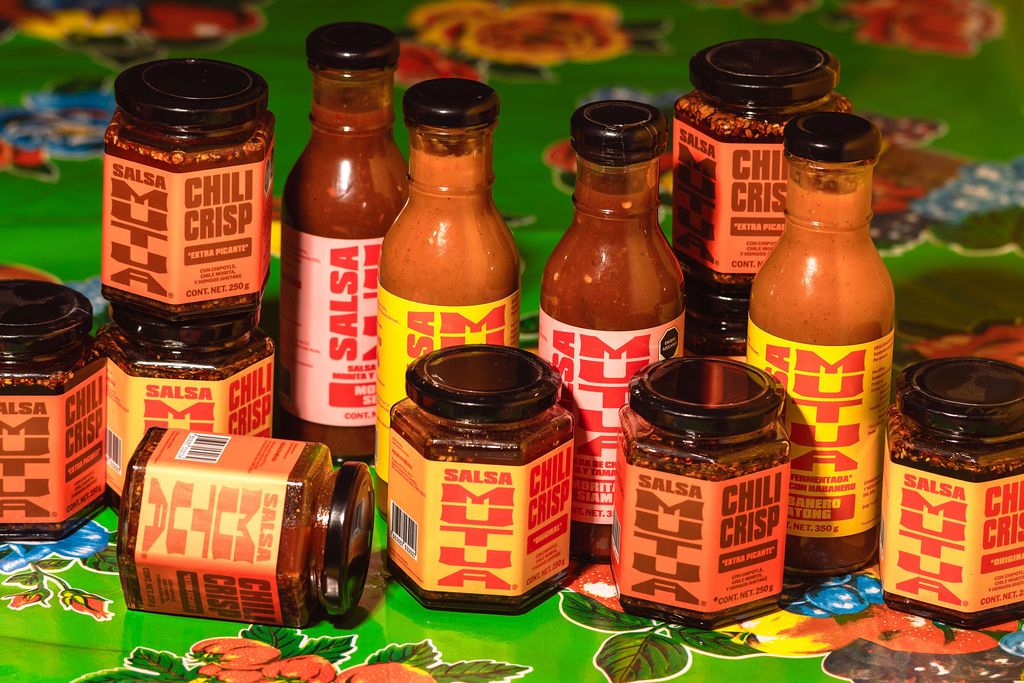
Salsa Mutua found a way to be loud and clever at the same time. Designed by Andrés Higueros, an independent graphic and type designer based in Mexico City, the brand’s story comes to life through the packaging. It’s playful and wise while representing the meeting of Mexican and Asian food traditions. That logo is dropped onto color-blocked labels in punchy combinations.
There’s warm yellow and red for the chili crisp, hot pink for the morita and tamarind salsa, orange and brown for the extra picante crisp, and a sunny yellow with red for the habanero katong. The typography pulls from old school street signage and neighborhood taquería menus. The chunky letterforms are stacked tightly together, giving it that scrappy feel you’d find on a hand-painted storefront sign.
It treats fusion as a design element rather than a marketing buzzword, letting two distinct visual cultures collide on a single label without either losing its identity. It’s designed to feel exciting to discover, and I, for one, am excited to have discovered it.