People often talk about “millennial branding” with an undertone of an insult, but what’s so wrong with soft color palettes and clean, minimal branding?
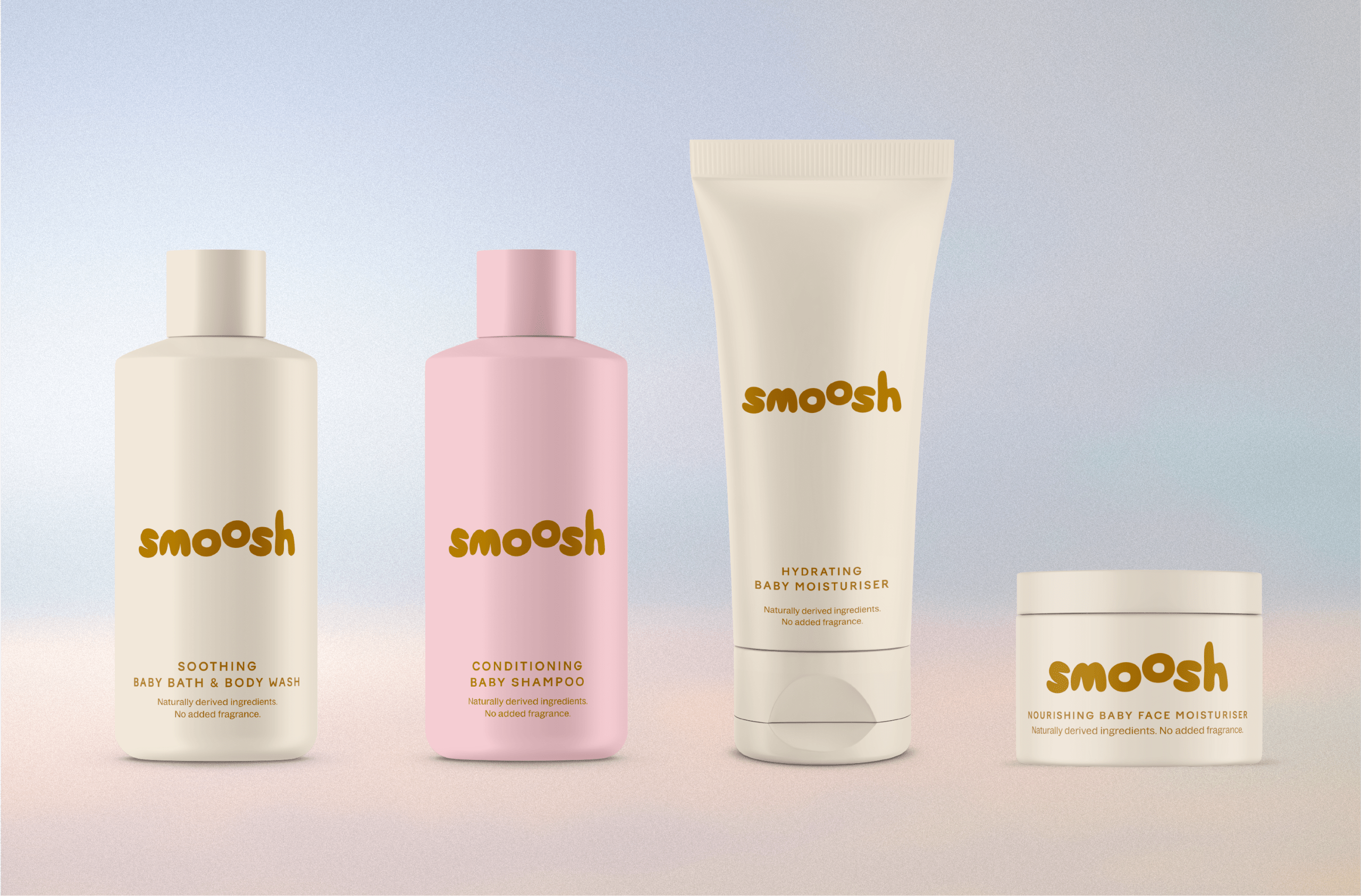
Smoosh, a baby care brand designed by LULACREATES, built its identity around a softness you can practically feel. The squishy lowercase letters with a floating “o” are drawn to mimic bubbles drifting mid-air, sitting on monochrome bottles in blush pink and warm cream.
The single color approach is a total pattern interruption compared to legacy brands and cartoon-covered competitors. It borrows the soft confidence of brands like Glossier, while the blobby wordmark keeps things playful enough to remind you that this is for babies. The whole thing is as calm as you hope bath time will be. It’s proof that “for baby” no longer has to mean “designed like a toy.”