Pearle’s Case for a Prettier Caviar

Pearle’s Case for a Prettier Caviar


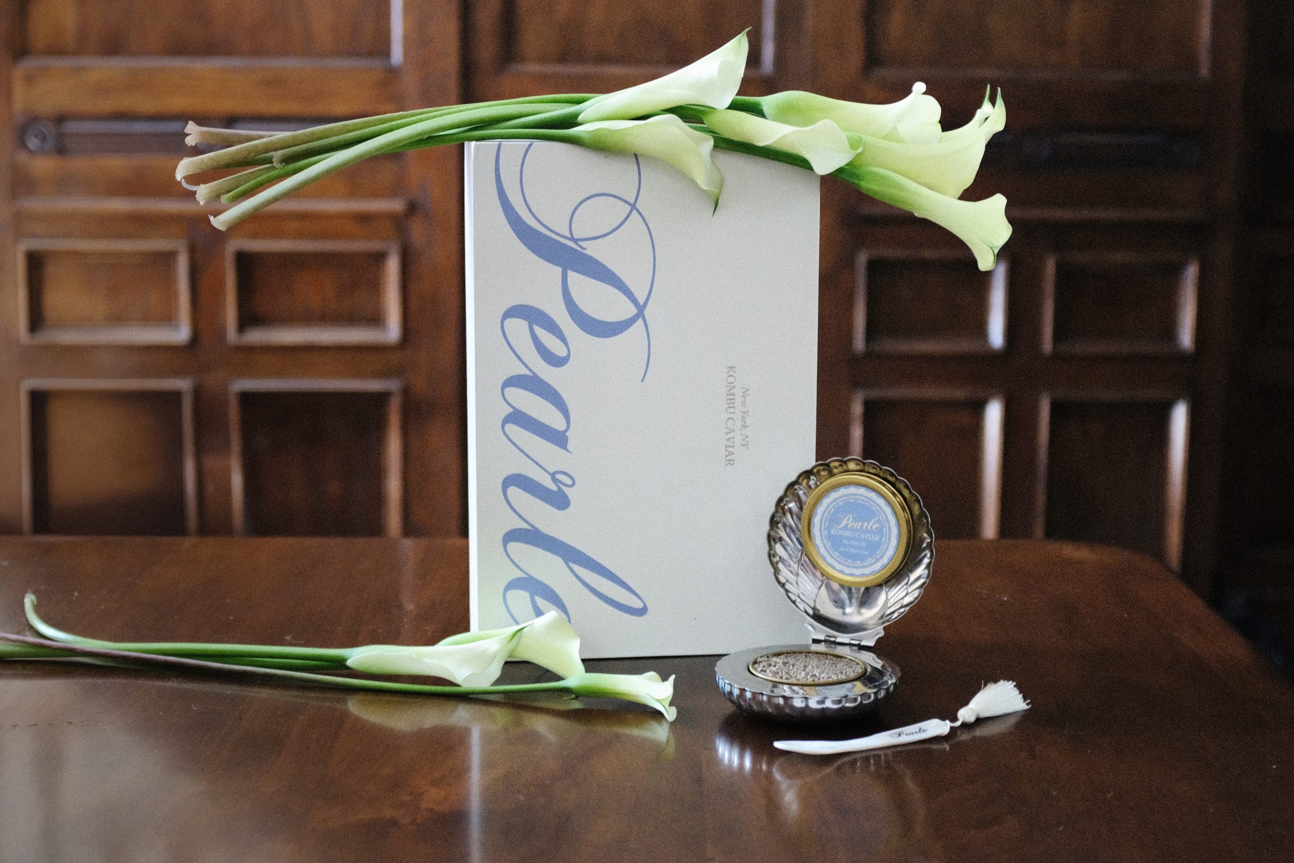
Is caviar packaging taking a page out of cosmetic packaging’s book? Pearle’s design by Sweety & Co might be the prettiest proof of it. The tin is nestled inside a hinged silver scallop shell that opens like a vanity compact, finished with an engraved script wordmark and a tasseled mother-of-pearl spoon.

That soft periwinkle label with its lacy border goes against all the black and gold currently on the caviar shelf, pulling instead from Wedgwood china, powder rooms, and the coquette revival rippling through CPG. Then there’s the oversized calligraphic script spilling down the outer box like a wedding invitation, romantic and a little theatrical but not tipping into camp territory. The whole thing makes a plant-based caviar look like a treasured antique, which is something I never previously would have thought possible. 


Source link

Get Packaging Industry News updates

Get the most critical Packaging Industry news in your email each week.


We promise no spam email will send you.

Leave a Reply

Your email address will not be published. Required fields are marked *

Related Articles
New California Labeling Law Aims To Reduce Food Waste
Barbara RuckerJul 8, 2026

Consumers are often confused by “best by,” “use by,” and “sell by” labels and…

Woodberry Packaging acquires two UK packaging businesses
Barbara RuckerJul 8, 2026

Woodberry Packaging has acquired UK packaging manufacturers Medica Packaging and FG Curtis, which trades…

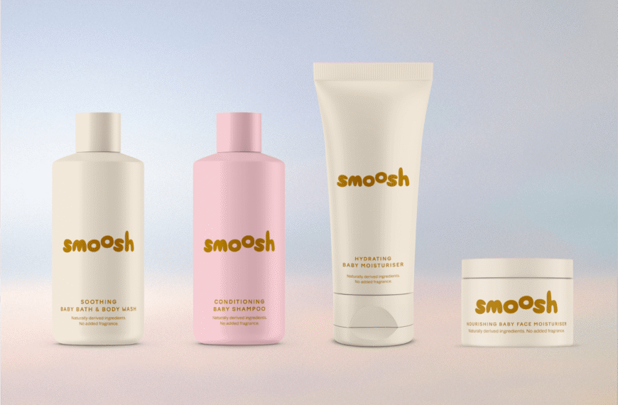
Smoosh Squishes the Baby Care Status Quo
Barbara RuckerJul 8, 2026

People often talk about “millennial branding” with an undertone of an insult, but what’s…

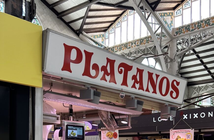
Tour de Type: Mamdani and Wendy’s Get the Bespoke Font Treatment, Plus a Street Tour of Valencia Signage
Barbara RuckerJul 8, 2026

Introducing Tour de Type, our monthly round-up of tip-top typography! DIELINE’s Charlotte Beach touches…