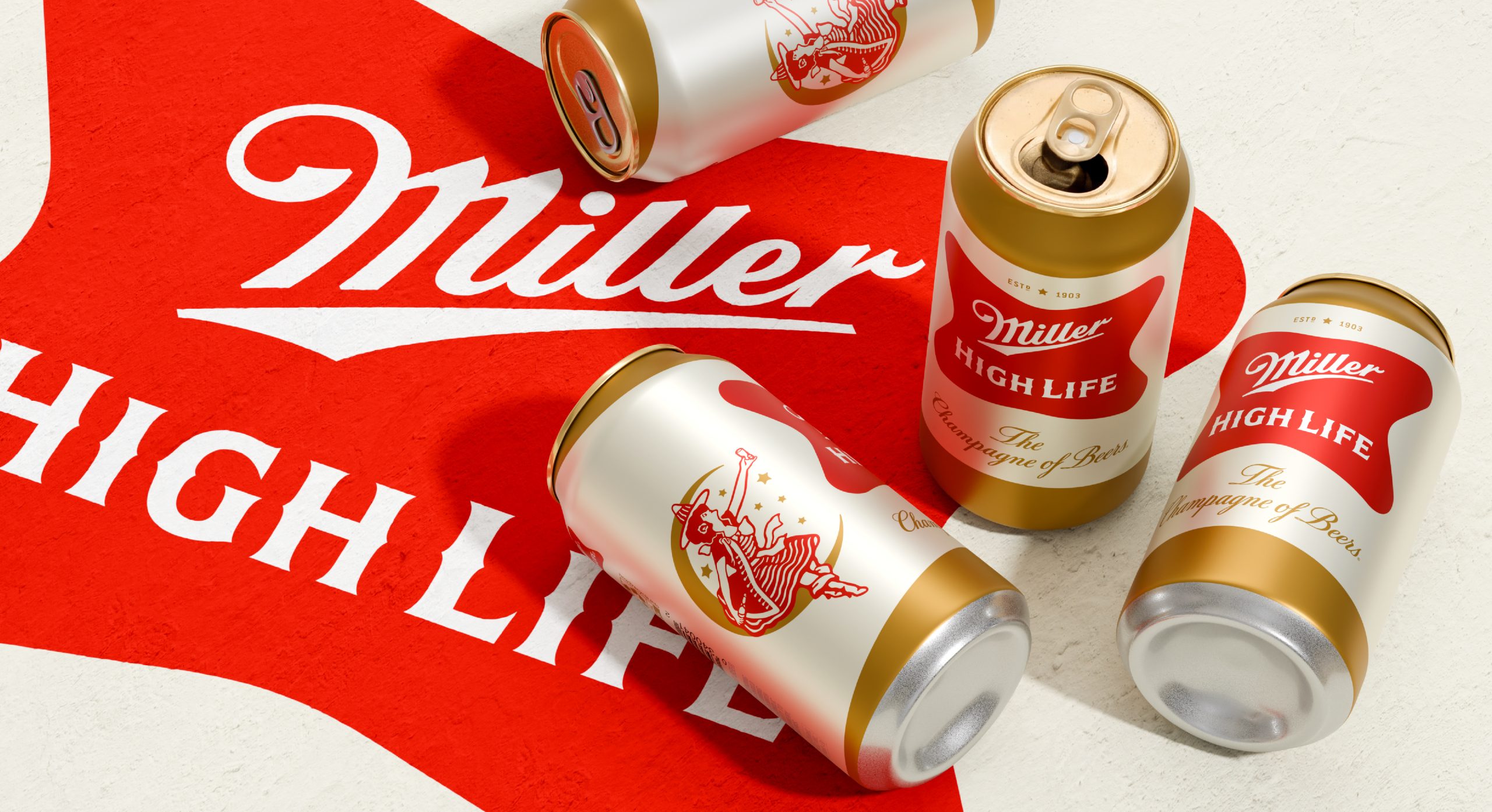
- Branding agency Soulsight refreshed the visual identity and packaging for Miller High Life.
- Besides a crisper color palette and a modern, simplified branding, Soulsight also gives greater prominence to Miller High Life’s “Girl in the Moon. The brand’s bottle designs, however, remain unchanged.
Miller High Life is the brewer’s oldest brand, and while in recent years most drinkers would put the beer in the dive-bar hall of fame alongside other legends like PBR, at one point, it was actually considered a premium beer. When Miller High Life debuted in 1903, its high carbonation and champagne-like bottle shape inspired the “Champagne of Beers” tagline. However, the brewer distanced itself from that perception around 1970 with the new, and ultimately successful, tagline, “It’s Miller Time.” This coincided with a few unfortunate packaging updates, but thankfully, they scrapped all that, and now we have the bottle we’ve all grown to love.
Of course, that doesn’t mean other parts of Miller High Life’s branding don’t need a little tightening up now and again.
Recently, the beermaker underwent a redesign and enlisted the CPG branding agency Soulsight to freshen up the beloved brewski while maintaining what makes it so special.

“Our creative journey started in a basement in Milwaukee, where Molson Coors keeps an impressive archive of Miller High Life’s historical assets such as cans, bottles, packaging, barware, signage, and advertising,” says Stephen Merlo, Soulsight creative director. “Looking at 123 years of history spread out, we were reminded that we’re caretakers of this brand as much as anything, and we wanted to stay true to its DNA with every adjustment we made.
Soulsight retained the signature brand elements, crisped and simplified the color palette, and removed the gold pinstripe from the soft cross logo. The cans are now lighter, with the green background replaced by a champagne-like gold, and the white band at the center of the can labels has been brightened.
The most noticeable change to Miller High Life’s brand identity, however, is the more prominent role of the “Girl in the Moon,” a brand asset used by the beer since 1907.


“The Girl in the Moon has been a beloved asset of the brand for generations, whether that’s brand loyalists getting her tattooed on their arms or serving as an icon of discovery for new consumers. She has historically played a role on the iconic bottle, but we sought to bring more character to the brand packaging by amplifying this distinctive asset that consumers love,” Merlo says.
New outer boxes now feature the Girl on the Moon above the revised red soft cross, and an image of the updated bottle sits to one side. The dark green stripe along the bottom has been removed, and its color is repurposed for secondary text. The “Champagne of Beers” utilizes a similar script font, but now in a brighter yellow.

While the cans got a glow-up, the bottle designs remained unchanged. It’s unclear why that touchpoint was left alone, but it was a pretty solid design to begin with, and the Girl in the Moon was already in an elevated position on the bottle neck.
If one of the main strategic changes is to bring more attention to the Girl in the Moon, of course, well, the bottles had already accomplished that. Without even a slight update, the bottle design feels slightly out of place in the grand scheme of the refresh.

“Redesigning an iconic heritage brand is an exercise in thoughtful curation. It’s about uncovering opportunities to strategically refine the consumer experience while staying true to the brand’s heritage, preserving its defining characteristics, amplifying long-standing assets that deserve renewed emphasis, and making meaningful improvements where they matter most. Striking that balance between heritage and progress can be a challenge, but it’s also the most rewarding part of the process, and one we love to take on,” Stephen says.
Miller High Life’s refresh comes as beer sales continue to slide amid consumers drinking less and rising gas prices, which are negatively correlated with purchases in attached convenience stores. Those headwinds might be tempered at the moment by the FIFA World Cup, perhaps making this summer a good time to debut a refreshed look for Miller High Life.