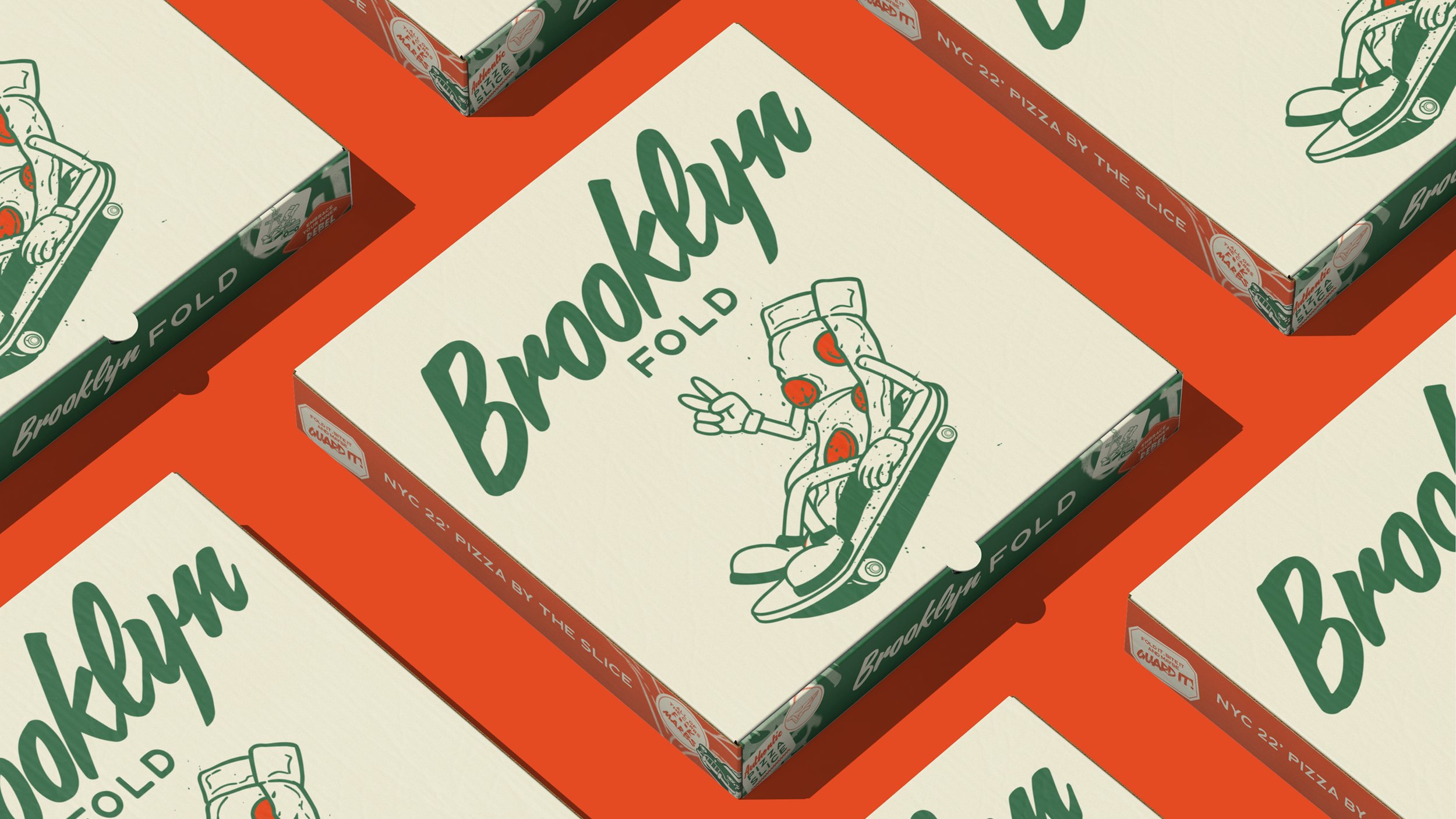
Studio Huemann’s packaging design for Brooklyn Fold channels the raw, dynamic energy of NYC through bold visual storytelling. Graffiti-inspired typography, featuring gritty brushstrokes and unapologetic marker fonts, dominates the packaging, reflecting the rebellious spirit of the city’s streets.
The color palette leans into rich, retro tones that feel pulled from a 90s NYC backdrop, paired with layered, nostalgic photography that captures the fast-paced, no-nonsense lifestyle of a true New Yorker. Every design choice, from the chaotic graffiti aesthetics to the cheeky text, mirrors the hustle, individuality, and unapologetic vibe of grabbing a folded slice on the go.
Rachel Taylor, founder and creative director of Studio Huemann, shares more of the background behind the design below.