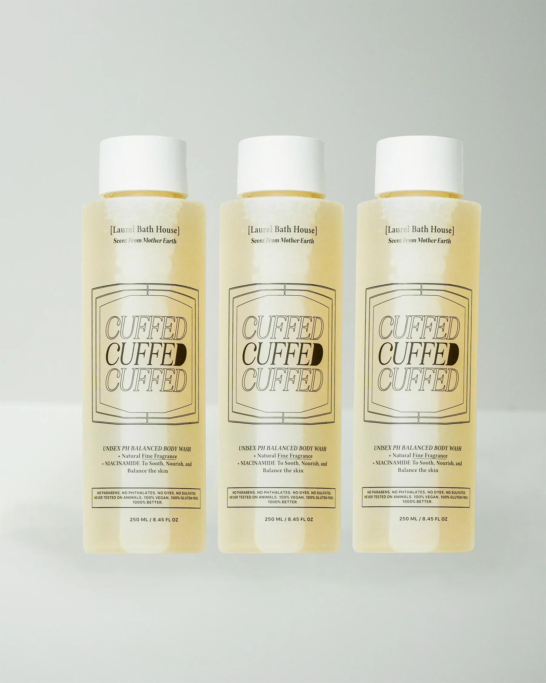
Laurel Bath House‘s packaging, designed by David Teitelbaum, combines irreverence with minimalist sophistication. The typography takes center stage, with bold, repetitive lettering and geometric framing filled with humor and a sense of structure.
The muted black-and-white palette is accented with subtle design details that balance clean aesthetics with a hint of edginess. The bold product names, such as “Mourning Wood,” are highlighted with dynamic, layered type treatments that make the packaging instantly unforgettable, as if the name itself wasn’t memorable enough.