MART’s Wine Packaging Is a Punch In the Face

MART’s Wine Packaging Is a Punch In the Face


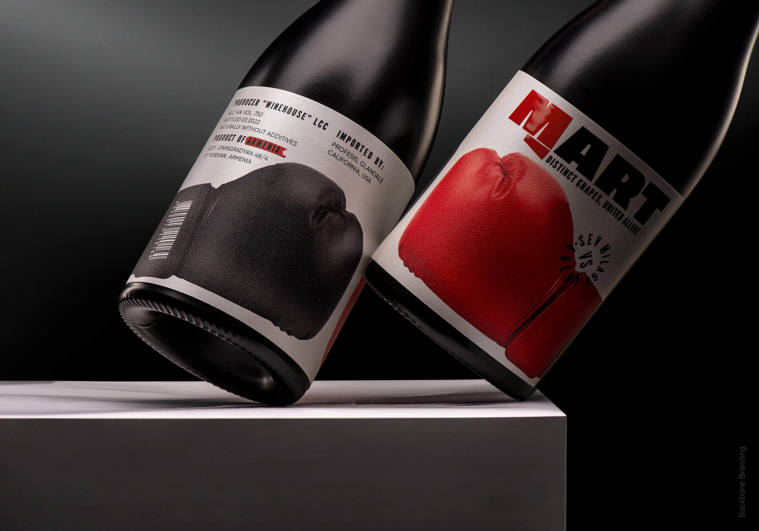
Wine packaging doesn’t often take a sporty approach to the packaging system, yet Backbone Branding designed MART’s packaging to visually represent the idea of confrontation leading to collaboration, drawing inspiration from the blending of two distinct grape varieties.

The bold labels feature imagery of red and black boxing gloves. The typography combines clean, block-style lettering with subtle distressed elements, reinforcing the themes of strength and balance. The minimalist color palette, with a focus on red, black, and white, creates a stark and powerful visual, ensuring the packaging stands out while effectively communicating the brand’s narrative.


Source link

Get Packaging Industry News updates

Get the most critical Packaging Industry news in your email each week.


We promise no spam email will send you.

Leave a Reply

Your email address will not be published. Required fields are marked *

Related Articles
Cattyfeast Turns Cat Food Into Design Purrfection
Barbara RuckerApr 15, 2026

REWOT s.r.l. gave FIDOVET’s Cattyfeast gold foil cans and a saturated flavor-coded palette that…

The Return of the Stubby? Garage Beer Bets on Stout Bottles and 24-Can Buckets
Barbara RuckerApr 15, 2026

Garage Beer resurrects the stubby bottle and drops a 24-pack hardware bucket to stand…

Geopolitical risk reshapes packaging investment case
Barbara RuckerApr 15, 2026

Investors are shifting their focus beyond traditional growth metrics to examine how well companies…

Sappi to Showcase Sustainable Tea Packaging at interpack
Barbara RuckerApr 15, 2026

At this year’s interpack, Sappi will be highlighting its latest innovations in sustainable tea…